Posts Tagged opalino
CiM colour testing: February 2017 colours
The spring 2017 limited editions from Creation is Messy had a whole load of transparent greens, and a whole load of opaque grey rods.
To start with, I picked out the first few colours that appealed to me (those greens!), along with a couple I thought would go with them.
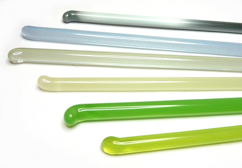
Chartreuse
Chartreuse (left) is a luridly bright light yellowy green which I love.
Inchworm
Inchworm (middle above) is another bright juicy green that is more transparent than CiM’s Poison Apple, which is a more standard opalino and can strike lighter and more opaque. Inchworm (like chartreuse) didn’t opacify at all and remained a lovely uniform misty transparent.
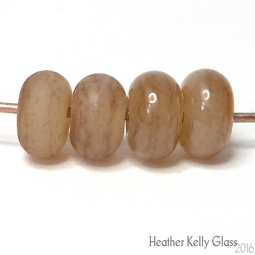
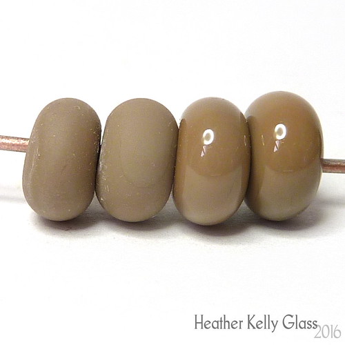
Cornsilk
I also love this colour (right beads), which is a uniform opalino beige. It is less streaky than Reichenbach’s mystic beige or pearl beige, and has a nice amount of translucency. Again, it does not seem to strike lighter or more opaque when worked for longer.
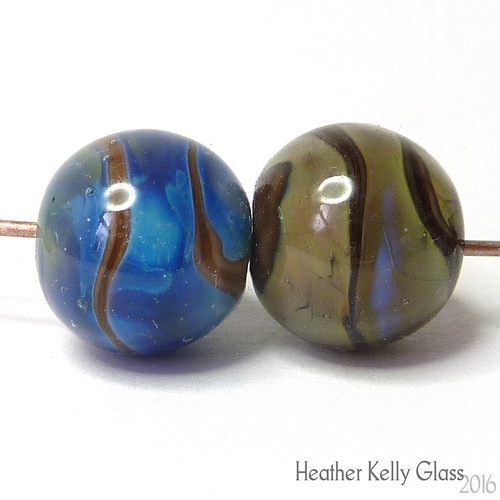
Yangtze and Sea Mist
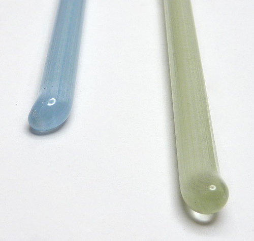
I am in two minds about Yangtze and Sea Mist. They are full of micro bubbles and the end of the rod boils very easily, both of these leaving bubbles that don’t go away. The rods themselves look faintly striped inside. I would normally dismiss these as poor quality glass, but I do really like the way the nuggets look – it is different from an opalino, or an etched bead, or from baking soda bubbles. They are muted non-uniform colours which are quite different from the rest of the palate. I think they would do well to pair with or mimic semi-precious beads which have cloudiness or inclusions, where most transparent glass beads alongside those look too brash and uniform in colour. So if you have a very specific use-case, these might be useful. I think I’d buy them if they weren’t too expensive, because I do have a lot of semi-precious beads I think they would go well with (labradorite, blue lace agate and so on).
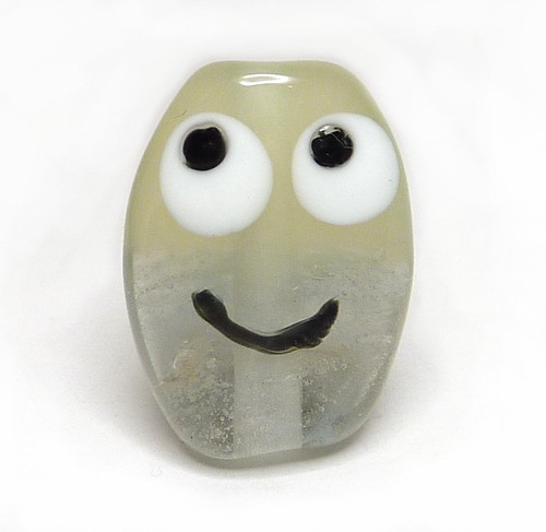
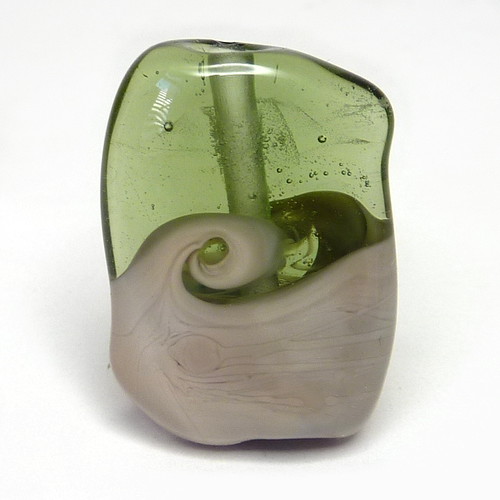
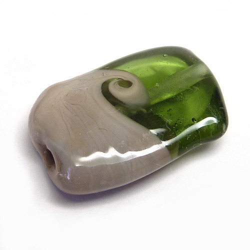
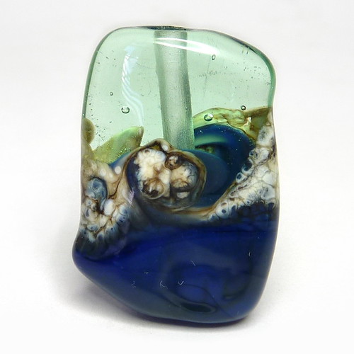
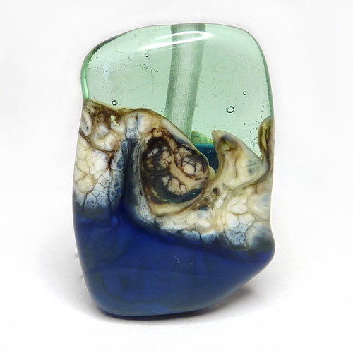
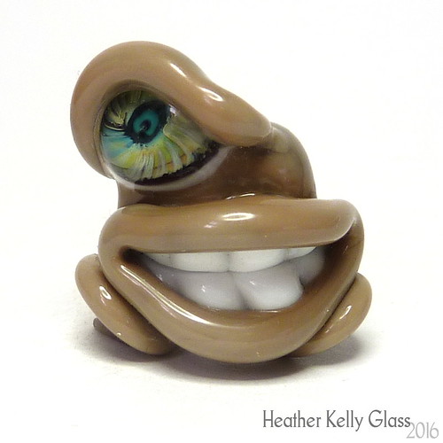
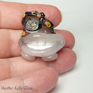
Troll
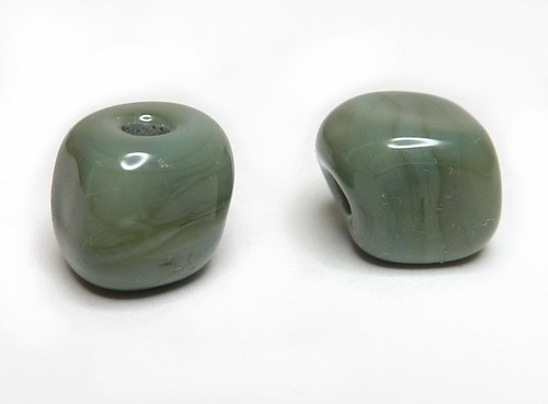
Troll is an opaque muted grey-green that is not unlike various of CiM’s other colours, but is still a type I like and find useful. I picked it as an opaque to go alongside these other colours for the two-tone beads below. It does strike greener than it appears on the rod, which is more of a blue grey.
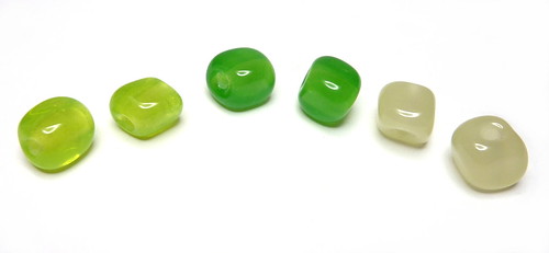
All the nuggets!
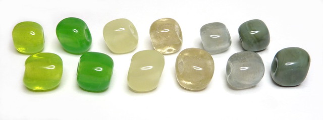
Aren’t they pretty just on their own?
Two-tone critters
Troll and chartreuse above.
Inchworm and bubbly yangtze above. I do like the colour fade from one to the other.
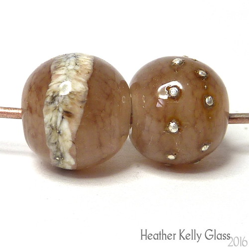
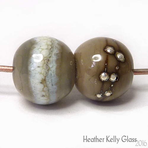
Cornsilk and very bubbly sea mist above.
You can see an area of Sea Mist that boiled on the rod on the back of this bead. For use in a non-organic bead this is a no. For one that is, there’s a possibility you might want to do this on purpose. (Again I like the transition from one colour to the other).
Troll and sea mist above.
Cornsilk and chartreuse above.
For the rest of the colours, I decided to do organic beads, and paired them up for this.
Peat Moss and Safari
Peat Moss is a suitably brown-olive transparent green. I trapped a couple of bubbles but on the whole it is very clear.
Safari looks greyish in the rod, and not having looked them up beforehand, I was very surprised that it immediately struck to a light sandy brown! The bead coming out of the kiln is more uniform than it looked going in, but you can still see a darker brown in one corner below.
I put a wrap of Effetre New Ivory across the transition and twisted it. It is a very handy insta-silvered-ivory rod and I really like the way it came out.
Peridot and Van Dyke Brown
Peridot is a pale transparent yellowish green. It does bubble quite easily, but they mostly ended up like tiny champagne bubbles here rather than scum, so don’t look too ugly.
Van Dyke Brown is like Safari but darker and greyer. This bead has kept a bit more of the colour variation (but on the light side) so we have a pale milky grey and a warm brown, with some transition areas of yellow and cooler darker grey. It remains streakier than Safari did.
Eel Grass and Pachyderm
Eel Grass is a midtone green. I got a few bubbles again but not too many.
Pachyderm is a grey-brown that has streaks and variations that are less extreme than the previous two. It has come out distinctly warmer and browner than the rod here. (I like these types of greys – CiM has had quite a few of them now).
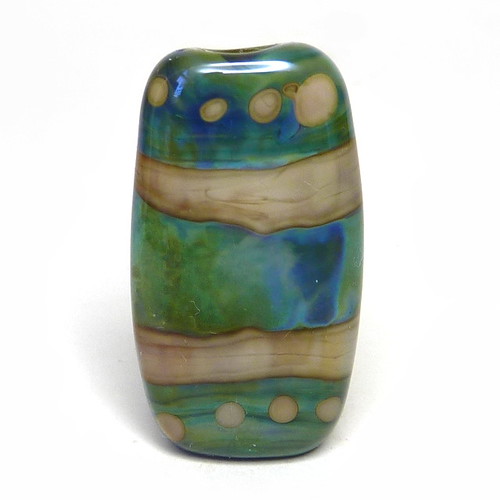
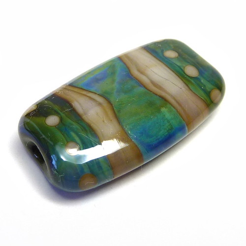
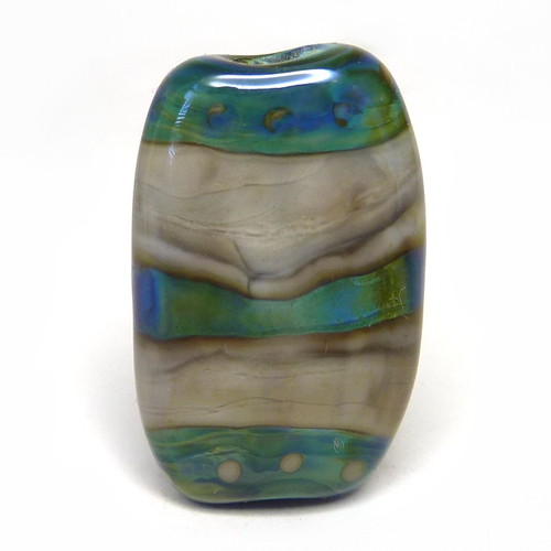
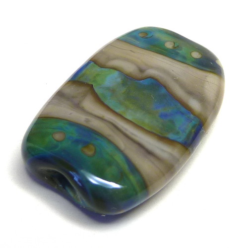
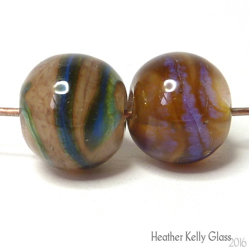
Refresh and Prussian Blue
Refresh is a very pretty pale green-aqua (and I think it looks great here!).
Prussian Blue is a dark easily-mottled streaky blue that will strike greenish. Here it has stayed mostly blue.
I added Effetre New Ivory again and I love the combination of all three colours.
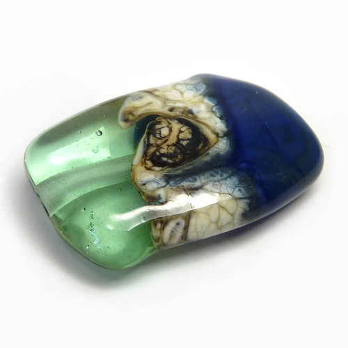
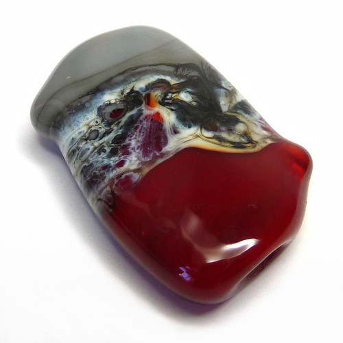
Hemoglobin and Koala
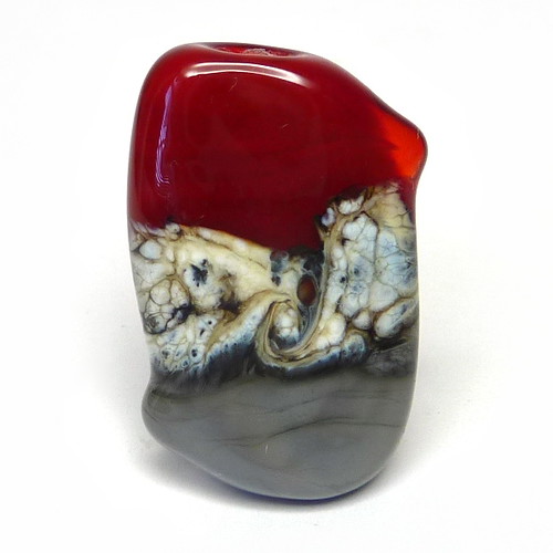
Hemoglobin is a semi-transparent red (only the little nub on the side has remained particularly transparent).
Koala is the actually grey one out of all these grey-looking rods. It has striated here next to the New Ivory and produced strong dark lines but from the bottom of the bead looks like it would stay pretty uniform away from that.
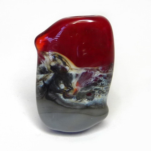
There’s an interesting bit here where the New Ivory is underneath and thin on top of the red (and over-reacted on top of the koala).
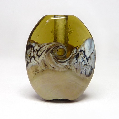
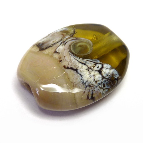
Okeanos tests
Finally, I did a pair of tests with Safari and Van Dyke Brown as the most reactive colours, combined with silver glass Double Helix Okeanos.
For these beads I had a central cylinder of the brown, a cap of okeanos on each end with little brown dots, and a wrap of okeanos around the centre on top of the brown. (The colours of the okeanos make it look like it is below the browns, which isn’t the case. You may need to stare at it a little!)
In this first bead with Safari, the central okeanos wrap has spread to be very wide. There are dark lines and interior reaction lines in the Safari (the latter particularly obvious in the dots).
The Safari has struck a bit darker than before, which you would expect, but there is plenty of lighter shade left. Okeanos has produced its pretty blues and greens easily.
Now for Van Dyke Brown.
Here, the central band of okeanos has been swallowed somewhat by the surrounding brown, making it much thinner than the previous bead. The Van Dyke Brown has struck browner than before, and only has grey in the dark reaction lines.
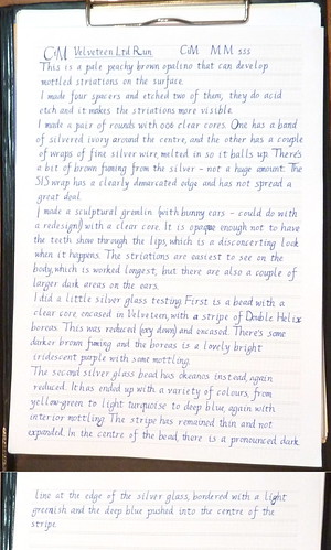
CiM colour testing: Velveteen, Toto, Allspice
These were the new CiM limited edition colours out in spring 2016. I am somewhat behind on writing this post as Flame Off happened…
Also, I got into fountain pens recently, and decided to use my post to practise my italic handwriting so that I got both the thing I had to do and the thing I wanted to do done. Pics thereof at the bottom.
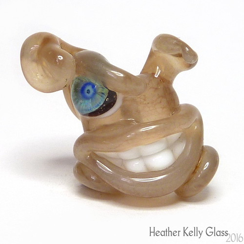
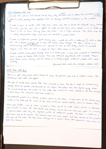
Velveteen
This is a pale peachy brown opalino that can develop mottled striations on the surface. I made four spacers and etched two of them; they do etch and it makes the striations more visible.
I made a pair of rounds with 006 clear cores. One has a band of silvered ivory around the centre, and the other has a couple of wraps of fine silver wire, melted in so it balls up. There’s a bit of brown fuming from the silver – not a huge amount. The SIS wrap has a clearly demarcated edge and has not spread a great deal.
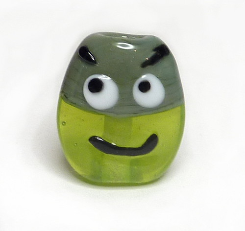
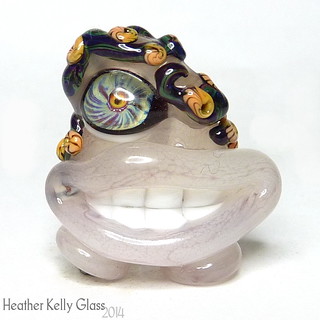
I made a sculptural gremlin (with bunny ears – could do with a redesign!) with a clear core. It is opaque enough not to have the teeth show through the lips, which is a disconcerting look when it happens. The striations are easiest to see on the body, which is worked longest, but there are also a couple of larger dark areas on the ears.
I did a little silver glass testing. First is a bead with a clear core, encased in Velveteen, with a stripe of Double Helix boreas. This was reduced (oxy down) and encased. There’s some darker brown fuming and the boreas is a lovely bright iridescent purple with some mottling.
The second silver glass bead has okeanos instead, again reduced. It has ended up with a variety of colours, from yellow-green to light turquoise to deep blue, again with interior mottling. The stripe has remained thin and not expanded. In the centre of the bead, there is a pronounced dark line at the edge of the silver glass, bordered with a light greenish and the deep blue pushed into the centre of the stripe.
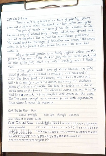
Toto
Toto is a soft milky brown with a touch of grey. My spacers came out a uniform colour. The etched pair look softer and lighter.
This pair of rounds have cores of 006 clear encased in Toto. One has a wrap of silvered ivory stringer which has spread and fuzzed at the edges. The surface has some darker grey areas. The second bead has two wraps of fine silver wire around the centre, melted in. It has fumed a dark brown line where the silver has melted in.
My sculptural gremlin is a fairly uniform colour on the front – it has some of the darker grey visible on the back and the soles of the feet, which are cooled swiftly when I flatten them.
Silver glass beads: core of clear, encased in Toto, spiral of silver glass which is reduced and encased in clear. The first bead uses boreas, which has not come out well – it is mostly a greenish brown with only the slightest patch of iridescent purple. The base is visible as a dark brown next to the boreas. The okeanos came out much better and has struck to blue-purples with green at the ends. The Toto shows through as a warmer brown with separation lines where it meets the okeanos.
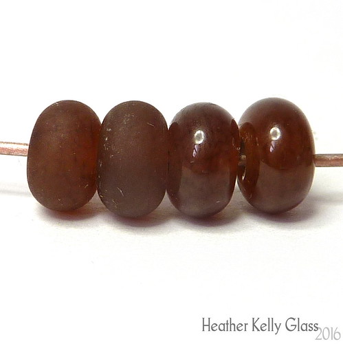
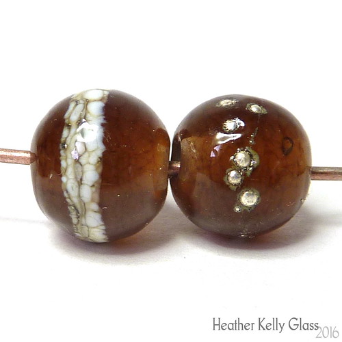
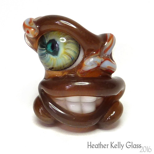
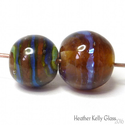
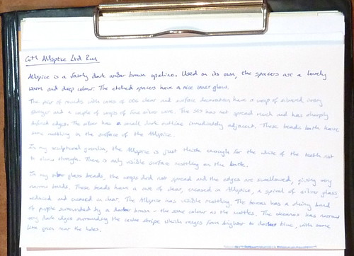
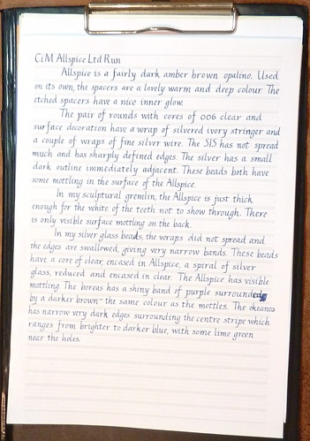
Allspice
Allspice is a fairly dark amber brown opalino. Used on its own, the spacers are a lovely warm and deep colour. The etched spacers have a nice inner glow.
The pair of rounds with cores of 006 clear and surface decoration have a wrap of silvered ivory stringer and a couple of wraps of fine silver wire. The SIS has not spread much and has sharply defined edges. The silver has a small dark outline immediately adjacent. These beads both have some mottling in the surface of the Allspice. (So do the spacers a little, but it isn’t so evident to the naked eye).
In my sculptural gremlin, the Allspice is just thick enough for the white of the teeth not to show through. There is only visible surface mottling on the back.
In my silver glass beads, the wraps did not spread and the edges and swallowed, giving very narrow bands. These beads have a core of clear, encased in Allspice, a spiral of silver glass, reduced and encased in clear. The Allspice has visible mottling. The boreas has a shiny band of purple surrounded by a darker brown – the same colour as the mottles. The okeanos has narrow very dark edges surrounding the centre stripe with ranges from brighter to darker blue, with some lime green near the holes.
Handwriting
For anyone interested in fountain pens.
Here is my normal handwriting, where I composed the text. I can write reasonably straight without guides.
These were written with a recently-acquired Osmiroid 75 fountain pen with an italic extra fine straight nib. The ink is whatever was in the pen – I’d just added enough water to get it going and decided to write it empty because I just discovered piston fillers take forever to clean out by sucking up and expelling water… You can see it ran out during the third composition – I’d added more water but it was too faint by then so I finished cleaning it.
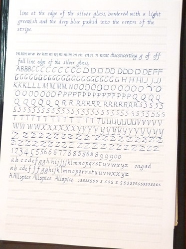
Here’s the first go – this was still with the old ink. I’d printed out some guide paper and this was the first time I’d used it. I was trying to get it all on one sheet (and failed) hence the lack of paragraph spacing. I was also putting one letter in each grid box, meaning my spacing is rather odd – the ‘m’s are very squished and some words are over-expanded. I used this calligraphy paper PDF generator printed out on my normal printer paper.
I aso realised I hadn’t practised capitals at all…
Second post: ink had run out so I refilled with Diamine indigo. The two look closer in the pics than they should – the original ink was a nice blue/blue-black and indigo has more of a steel grey tint in it. This time I used slightly smaller paper – 0.5 rather than 0.6mm nib size, and with halfway vertical guides too. I mostly ignored the guide boxes this time, just using them to go vaguely in the right direction and not for spacing. Also less obvious in the photo, it starts out with wetter writing so the letters are darker, then for the rest my writing angle must have changed, as I have drier writing and it also gets bigger. That was partly the fault of writing without bright enough light coming from the right direction, as I couldn’t always see the guidelines… The part at the bottom is darker and smaller again. I couldn’t work out how to write the correct s at that size – it’s supposed to be a narrow letter and it was very difficult not to write it wider.
Third: I went back to the bigger size but kept the extra verticals. It’s looking a bit better, though still various irregularities.
Some practise, may also show the ink colour difference a little.
Big practice, back with the Lamy Joy and 1.9mm nib. I managed the s shape once or twice at this size!
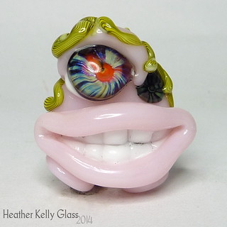
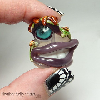
CiM colour testing: Whisper, Primrose, Coronation Day, Bubblebath
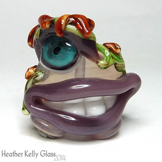
Whisper
This gremlin is made of Whisper, which I liked better than I thought I would! It stays far more opaque than expected – again, the body is over clear and has a bit more misty translucence, but the lips are opaque enough not to let the teeth show through (which is good as it can look kinda scary!). This is rather like Frangipani, but a bit less pink, I think. Like a very diluted one of the plum uniques. It gets the same slight webbing on the surface as you work it.
This rod of Whisper was pretty shocky – I had to baby it back into the flame to stop it shocking off above where I had been working, and when adding the upper lip I must have got the flame too close to a cooler section, as it shocked right off, leaving me with a half-applied lip ending in a centimetre of rod.
In hand to make it stand out a bit better from the background.
Primrose
Primrose is a rather pretty pink (but primroses are yellow!). This rod was really shocky though – worse than Whisper – and it would crack about an inch above the end every time I took it out of the flame and put it down, so when I next had to use it, I needed to not only bring it back slowly high up in the flame, but make sure I got that whole bottom inch heated up before using it. Again, it cracked off while doing the top lip. The actual colour is really nice, and the glass is fine to work with once molten, but you do need to be careful. I imagine using this for one-at-a-time dots would strain one’s patience.
I don’t know if this will be the case with all rods of Primrose or if this was a particularly nasty one, but for a rod without airbubbles running through it this was pretty bad (those just tend to explode in all directions). I was using it alongside a thick Effetre clear rod for the cores, which can have a tendency to crack at the end when cooling just because it’s bigger, hence needing to go back in carefully enough to melt those cracks (but they do heal quickly again). That was far less hassle to use than the Primrose. I don’t even know if keeping the end preheated would help, because it might just shock above that.
A lot of rods do the “crack a bit when you put them down” thing, but usually it’s just at the tip and there’s no real problem. What was unusual here was how far down it cracked, which is what made it harder to use. I use a rod rest, so wasn’t putting it down on a surface either.
Coronation Day
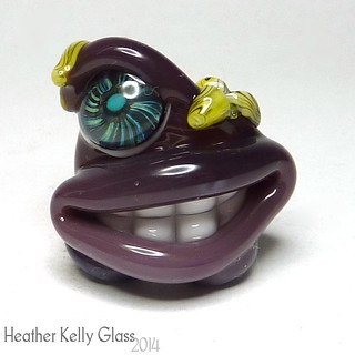
Coronation Day is a dark opal purple. I like this one – nice to use, pretty colour. It’s very like some of the darker plum uniques, again, but I’d need to put them side by side to check differences. You may be able to see here – the feet and bottom lip have opacified and lightened more, while the top stayed darker and more translucent. This is the same thing a lot of the CiM opals do, and depends on how much heating and cooling they get after the last time they were molten (and mayybe on kiln position too). I added the little yellow flowers on the head after doing the feet, but didn’t melt the head while doing that.
Bubblebath
Bubblebath is a similar shade to Whisper in a pale rose quartz kind of way, but far more translucent. The body over clear is very transparent, and I didn’t even try using it for the lips and eyelid, so those are Coronation Day again. I should do some transparent styles of bead with this – could be interesting encasing something shiny, and should make lovely nuggets on its own.
Another look.
Twisties
I’ve been playing a little with some silver glass twisties too. Trial and error, because it’s hard to know what’s what with something where the end result depends on what glass you used in the twistie, how you constructed it (base vs stripes vs encasing), what bead base you put it on, and how you treat it after it’s on the bead! I mentioned before that my twistie with red roof tile and hades in it didn’t turn out as intended because those two glasses swamped the stripes of silver glass.

Couple of silver glass twisties
They looked pretty before I used them, at least!
The redder looking one is CiM stoneground with stripes of kalypso, psyche, terra 2 and aurae. Lord knows what the best way to treat that would be! I put clear on the end for the pull, so I also have some thin end pieces that have clear twisted into them too. Which can be fun.
The grey-green one is CiM canyon de chelly with stripes of Lauscha olive and ekho.

Twisties on ivory
This bead is ivory with the aforementioned RRT twistie on one side and a thin end piece of the stoneground twistie on the other. With twists and clear dots. I reduced it a bit. Ivory probably isn’t a great choice of background colour to be doing this on in the first place…

Dragon's egg
This was from before: also the RRT twistie. Ivory, silver leaf, twistie, reduced and encased. It wasn’t what I was expecting, but it’s rather nice in an organic way. I’m calling it a dragon’s egg.

Opalino twistie
This is the stoneground twistie on a white opalino base. Reduced and it has a lot of shine and fuming.

RRT tube with twistie
In this case, the base bead was red roof tile, and it has the olive twistie on top. It’s interesting and again organic but more subtle this time. Probably still not the best base to show off the twistie on.
Dots
February’s theme of the month was dots! I mentioned it when I showed my pink dotty heart a couple of posts down, but here’s the rest of what I made.

Psyche and opalino dotties
These are psyche dots on nile green opalino and white opalino. You can see that the silver glass has fumed the white and has also affected the colour of the green.

Dotty BHBs
These big hole beads have dots in periwinkle, rubino and opal yellow. The bead on the right has a base of tongue pink (half struck) and the other two have a base of CiM plum unique-3, which is much paler than normal plum. You can see it’s formed darker separation lines under the dots.

Adamantium BHBs
These BHBs are CiM admantium with dirty martini and mermaid dots. They spread so I didn’t get crisp edges on these.

Marmalade set
These beads have shards made from Lauscha brown/white layered rods on a white background. I was thinking the layers would show up over the white, forgetting that the layers *are* white and so don’t look different at all! They were visible in the shards before I applied them, though :p
Next time I try it over clear.
I do like the effect – they’re marmaladey and I added Kaz murrini and opaque light red dots.

Terra 2 BHB
A BHB in black with terra 2 dots topped with clear. There’s more iridescence in person.
Off-mandrel hearts
Serendipitously, Holly of Holly’s Folly Glass posted this off-mandrel heart tutorial and I thought “Ooh, that looks interesting” so I went off to have a go.

First off-mandrel heart
First try! I used a thick rod of transparent pale blue for the base and added twistie ends in neutral and green. I twisted the centres, shaped the heart end and added a loop in baby blue (tricky!). Then I held the heart in my reverse-action tweezers, not the loop, in case it might shock. I took off the rod and heated the end to round off, then tried to put the heart into my kiln… but the tweezers wouldn’t let go! So I stuck it in my annealing bubbles to cool down. My tweezers have very thin pointy ends, and one of them had got embedded in the glass. I hadn’t put them in the flame, but I most have got them too hot anyway because it was well and truly stuck. In the end I just bent off the tweezers, so now one of the points is shorter than the other, and the remains are still in this bead… After this, I used my needlenose pliers instead and always hold the loop!
I made heart 2 (the blue one below) in the same way, without the mishap. Then I read Mr Smiley’s heart tutorial (there are pics later on in the thread) and I made more… and more. They’re fun and rather addictive, but I still find the loops tricky!

Blue and pink off-mandrel hearts
Blue heart: pale blue with a blue twistie and a green+brown twistie.
Pink heart: Reichenbach mystic pink mixed about with Lauscha soft clear. Goldstone ribbon on the surface and encased. The shape has a bit too much on one side for my liking.

Citrine twistie heart
This heart is Lauscha citrine with my red roof tile twistie. There were a couple in between the pink heart and this one, but they’re off to the Valentine’s swap so I won’t show them yet. The RRT twistie hasn’t been a great success – basically it may as well be RRT and hades only, because those are the colours that take over.

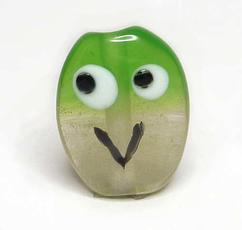
Opalino raku heart
I really like this one. It’s a white opalino base with coe 96 raku frit. I didn’t strike the frit properly, though I did get the opalino hot enough that it’s started displaying faint black spiderwebbing in places. Neither of which I mind – I think it gives it a delicate look, and the muted colours go well with it.
CiM crocus, pink champagne, peacock and chalcedony
CiM has some lovely opalino colours, which are much better behaved than Effetre’s opalinos. Here are some spacers in a few of them (plus pink champagne).
CiM crocus is a light opalino purple that keeps its translucency. Lovely, and there’s nothing like it from other manufacturers. Pink champagne is a pretty transparent pink.

CiM crocus and pink champagne
Here’s CiM chalcedony – an opalino light blue. Less translucent than crocus and tends to opacify if you work it for a long time. I also found it tricky to photograph – it should be slightly more translucent than it appears here.

CiM chalcedony
This last is CiM peacock with cobalt trails, encased in clear and with Kaz’s multicolour mermaid murrini and MCD dots. Peacock is a gorgeous very translucent green opalino. I made a necklace with beads that show the colour more obviously and I’ll put that up when I can.

CiM peacock with MCD
Incidentally, these are two separate blue frits over crocus. I was going for less coverage but they spread out a lot! You can see the translucency of the base gives them a glow, though.

Crocus with blue frits
Lampwork – newbie week 6
March 29 – April 4
CiM colour tests
CiM spacers
This week I started with a treat and got out my CiM sample pack. Spacers above of most of them. I haven’t done Peace, Hades, Stoneground, Canyon de Chelly or Khaki – Peace because it is white, Hades because it is an intense black and a spacer would be a waste, and the last three so far because they work best as reactive bases for other things (also because they are expensive and I only have very skinny rods of the first two!). I might reconsider that, though. I already know I really like Stoneground from a little bit added to a more recent bead.
It’s nice glass to melt – I was particularly impressed by the transparents. Pulsar and Clockwork felt lovely. I’ve noticed that a lot of the opaques got much darker round the mandrel – particularly noticeable on Thai Orchid, Glacier and Celadon.
For some reason, I’m still finding it rather difficult to take pictures of red and purple beads and get the colours right if there are other colours in the picture too. Possibly a combination of my camera settings and jpeg compression. The reds come out hugely saturated and darker than they should be. The picture should be reasonably accurate (by my monitor at least!) but the purples should still be a bit lighter. Oh, and Lipstick varies depending on the type of lighting – it’s brownish there but much redder in sunlight or halogens.
Opalinos and turquoise

Week 6 beads
I bought up someone else’s stash of opalinos – it seemed like a good opportunity to try them out! The UK suppliers don’t tend to carry them and they’re one of the things newbies get warned off because they aren’t always strictly compatible with other colours and burn easily. I really liked them – didn’t have a problem with them getting too hot on my hothead and I was careful but they didn’t seem to be shocky. And I love the results! Here we have nile green, periwinkle and carnelian opalinos. The transparent baby blue bead was me trying carnelian opalino stringer on it – not very noticeable! Then I did some dark turquoise beads with black stringer design.
Faux boro

Faux boro 1
I started doing some experiments with this – it’s the straw yellow plus iris gold frit version. The first pic is just that, wound directly on from the rod and encased in clear. The blues are fairly dark and the whole thing has a slight cola overtone in some lights, particularly noticeable along the mandrel. I think this might have something to do with straw yellow being machinemade now – certainly I’ve seen people saying that the current available batches aren’t as good as older ones.

Faux boro 2
The second is straw yellow with iris gold frit, pulled into stringer and wrapped over a tube of clear then encased. I was wondering if that would give less cola colour. Not so much! You can see blues from some angles, but not in this photo :p
I did a couple more experiments with it this week too – should be in next week’s post!
Flamingo

Flamingo beads
I really like these. Light grey transparent core, which I handshaped into ovals, then added diagonal stringer lines in black, anise white and carnelian opalino. Melted in, gravity swirled, reshaped and then mashed flat. Pretty!
Buy Beads
I am HeatherKellyGlass on Etsy

Flickr Photos

