The spring 2017 limited editions from Creation is Messy had a whole load of transparent greens, and a whole load of opaque grey rods.
To start with, I picked out the first few colours that appealed to me (those greens!), along with a couple I thought would go with them.
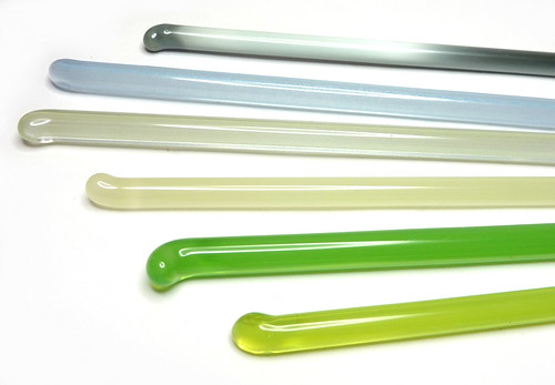
Chartreuse
Chartreuse (left) is a luridly bright light yellowy green which I love.
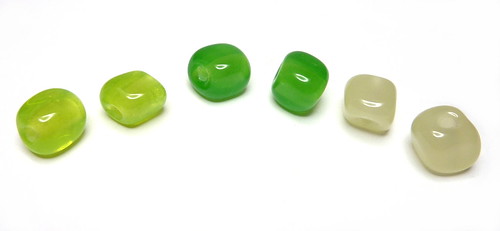
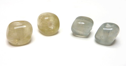
Inchworm
Inchworm (middle above) is another bright juicy green that is more transparent than CiM’s Poison Apple, which is a more standard opalino and can strike lighter and more opaque. Inchworm (like chartreuse) didn’t opacify at all and remained a lovely uniform misty transparent.
Cornsilk
I also love this colour (right beads), which is a uniform opalino beige. It is less streaky than Reichenbach’s mystic beige or pearl beige, and has a nice amount of translucency. Again, it does not seem to strike lighter or more opaque when worked for longer.
Yangtze and Sea Mist
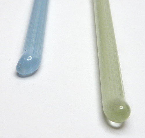
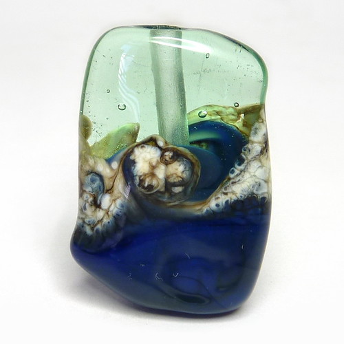
I am in two minds about Yangtze and Sea Mist. They are full of micro bubbles and the end of the rod boils very easily, both of these leaving bubbles that don’t go away. The rods themselves look faintly striped inside. I would normally dismiss these as poor quality glass, but I do really like the way the nuggets look – it is different from an opalino, or an etched bead, or from baking soda bubbles. They are muted non-uniform colours which are quite different from the rest of the palate. I think they would do well to pair with or mimic semi-precious beads which have cloudiness or inclusions, where most transparent glass beads alongside those look too brash and uniform in colour. So if you have a very specific use-case, these might be useful. I think I’d buy them if they weren’t too expensive, because I do have a lot of semi-precious beads I think they would go well with (labradorite, blue lace agate and so on).
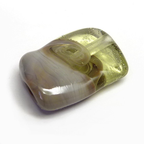
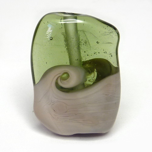
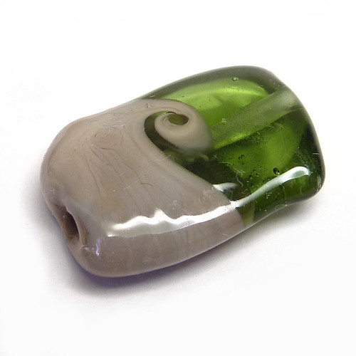
Troll
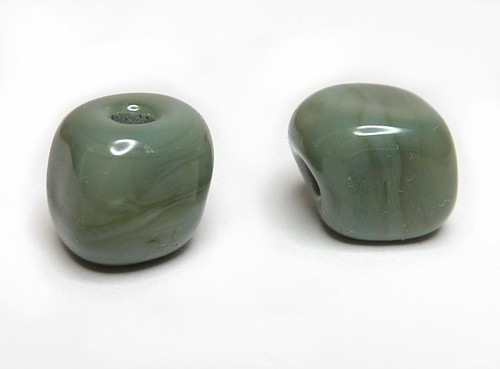
Troll is an opaque muted grey-green that is not unlike various of CiM’s other colours, but is still a type I like and find useful. I picked it as an opaque to go alongside these other colours for the two-tone beads below. It does strike greener than it appears on the rod, which is more of a blue grey.
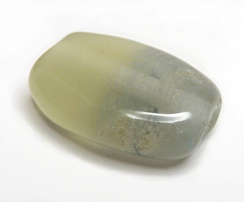
All the nuggets!
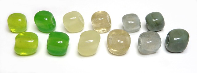
Aren’t they pretty just on their own?
Two-tone critters
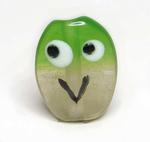
Troll and chartreuse above.
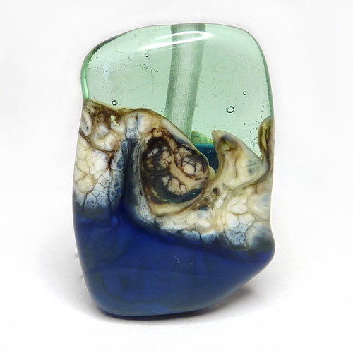
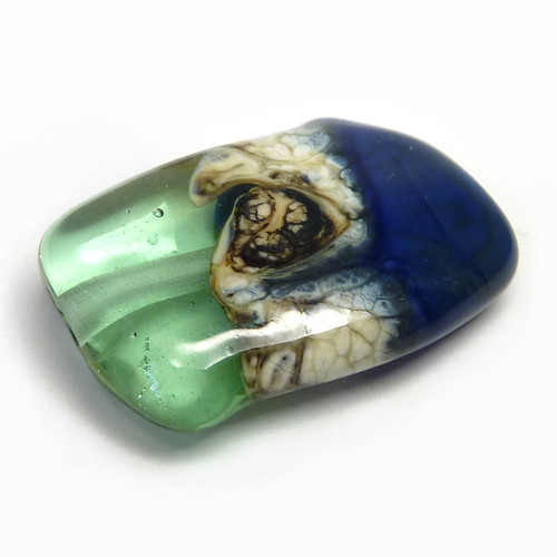
Inchworm and bubbly yangtze above. I do like the colour fade from one to the other.
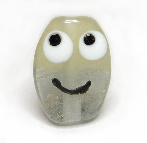
Cornsilk and very bubbly sea mist above.
You can see an area of Sea Mist that boiled on the rod on the back of this bead. For use in a non-organic bead this is a no. For one that is, there’s a possibility you might want to do this on purpose. (Again I like the transition from one colour to the other).
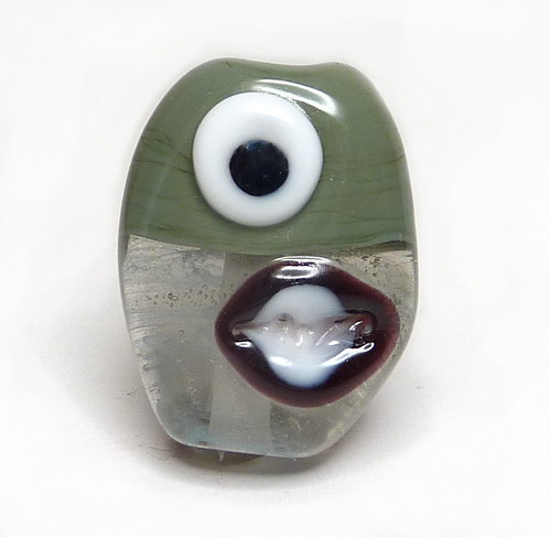
Troll and sea mist above.
Cornsilk and chartreuse above.
For the rest of the colours, I decided to do organic beads, and paired them up for this.
Peat Moss and Safari
Peat Moss is a suitably brown-olive transparent green. I trapped a couple of bubbles but on the whole it is very clear.
Safari looks greyish in the rod, and not having looked them up beforehand, I was very surprised that it immediately struck to a light sandy brown! The bead coming out of the kiln is more uniform than it looked going in, but you can still see a darker brown in one corner below.
I put a wrap of Effetre New Ivory across the transition and twisted it. It is a very handy insta-silvered-ivory rod and I really like the way it came out.
Peridot and Van Dyke Brown
Peridot is a pale transparent yellowish green. It does bubble quite easily, but they mostly ended up like tiny champagne bubbles here rather than scum, so don’t look too ugly.
Van Dyke Brown is like Safari but darker and greyer. This bead has kept a bit more of the colour variation (but on the light side) so we have a pale milky grey and a warm brown, with some transition areas of yellow and cooler darker grey. It remains streakier than Safari did.
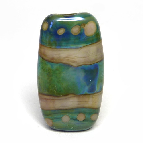
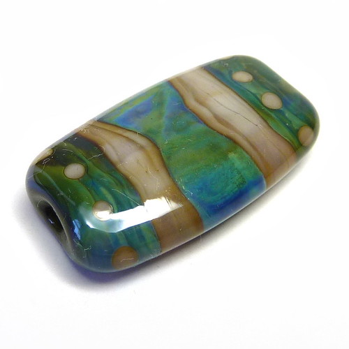
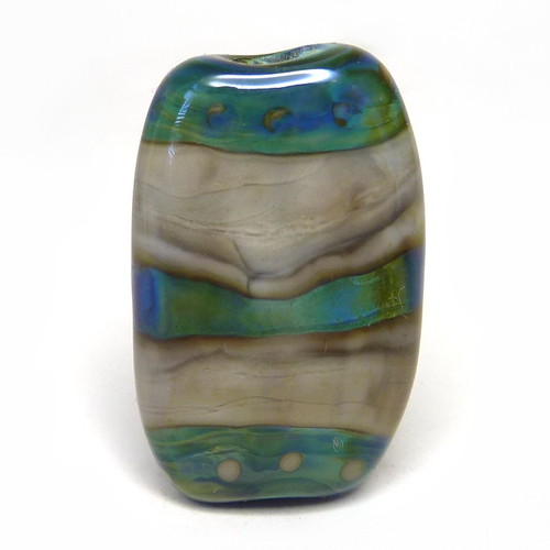
Eel Grass and Pachyderm
Eel Grass is a midtone green. I got a few bubbles again but not too many.
Pachyderm is a grey-brown that has streaks and variations that are less extreme than the previous two. It has come out distinctly warmer and browner than the rod here. (I like these types of greys – CiM has had quite a few of them now).
Refresh and Prussian Blue
Refresh is a very pretty pale green-aqua (and I think it looks great here!).
Prussian Blue is a dark easily-mottled streaky blue that will strike greenish. Here it has stayed mostly blue.
I added Effetre New Ivory again and I love the combination of all three colours.
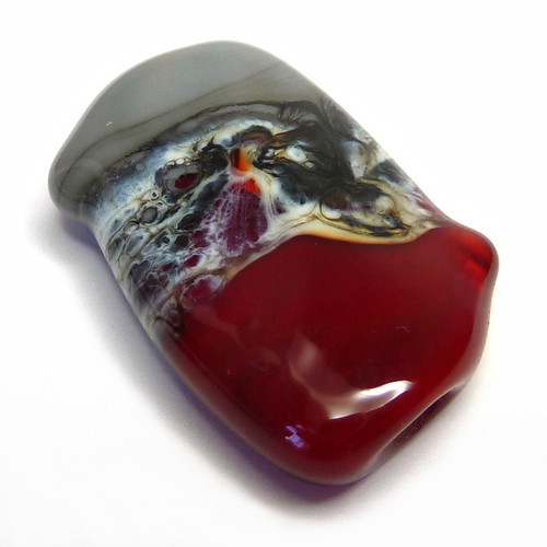
Hemoglobin and Koala
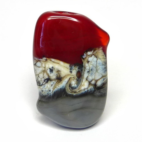
Hemoglobin is a semi-transparent red (only the little nub on the side has remained particularly transparent).
Koala is the actually grey one out of all these grey-looking rods. It has striated here next to the New Ivory and produced strong dark lines but from the bottom of the bead looks like it would stay pretty uniform away from that.
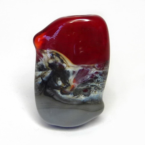
There’s an interesting bit here where the New Ivory is underneath and thin on top of the red (and over-reacted on top of the koala).
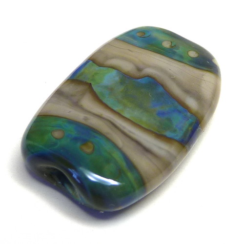
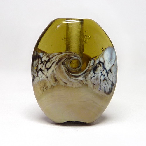
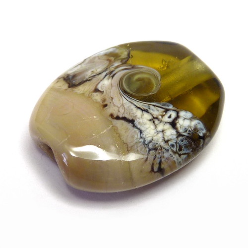
Okeanos tests
Finally, I did a pair of tests with Safari and Van Dyke Brown as the most reactive colours, combined with silver glass Double Helix Okeanos.
For these beads I had a central cylinder of the brown, a cap of okeanos on each end with little brown dots, and a wrap of okeanos around the centre on top of the brown. (The colours of the okeanos make it look like it is below the browns, which isn’t the case. You may need to stare at it a little!)
In this first bead with Safari, the central okeanos wrap has spread to be very wide. There are dark lines and interior reaction lines in the Safari (the latter particularly obvious in the dots).
The Safari has struck a bit darker than before, which you would expect, but there is plenty of lighter shade left. Okeanos has produced its pretty blues and greens easily.
Now for Van Dyke Brown.
Here, the central band of okeanos has been swallowed somewhat by the surrounding brown, making it much thinner than the previous bead. The Van Dyke Brown has struck browner than before, and only has grey in the dark reaction lines.