These were the new CiM limited edition colours out in spring 2016. I am somewhat behind on writing this post as Flame Off happened…
Also, I got into fountain pens recently, and decided to use my post to practise my italic handwriting so that I got both the thing I had to do and the thing I wanted to do done. Pics thereof at the bottom.
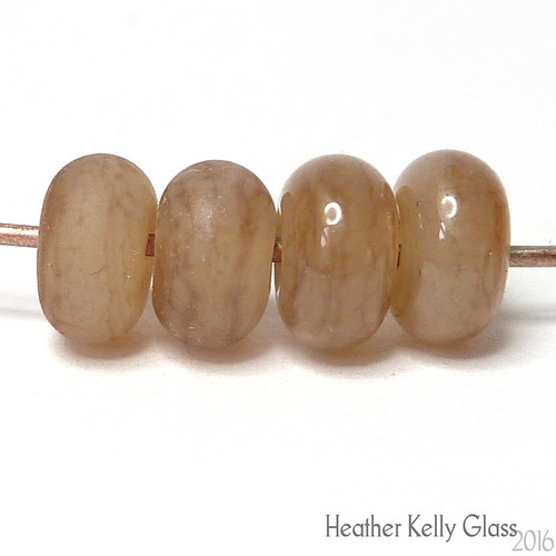
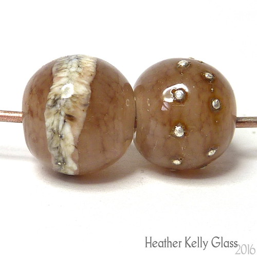
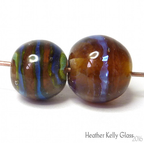
Velveteen
This is a pale peachy brown opalino that can develop mottled striations on the surface. I made four spacers and etched two of them; they do etch and it makes the striations more visible.
I made a pair of rounds with 006 clear cores. One has a band of silvered ivory around the centre, and the other has a couple of wraps of fine silver wire, melted in so it balls up. There’s a bit of brown fuming from the silver – not a huge amount. The SIS wrap has a clearly demarcated edge and has not spread a great deal.
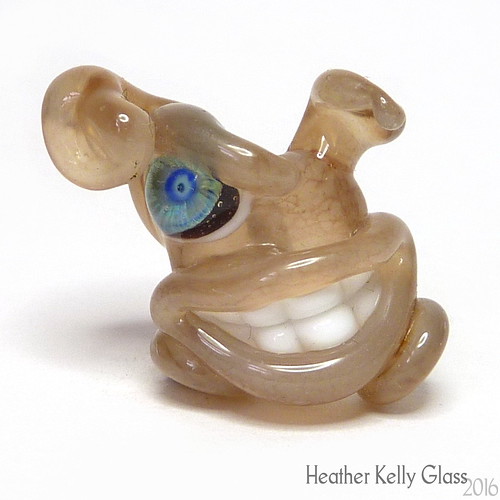
I made a sculptural gremlin (with bunny ears – could do with a redesign!) with a clear core. It is opaque enough not to have the teeth show through the lips, which is a disconcerting look when it happens. The striations are easiest to see on the body, which is worked longest, but there are also a couple of larger dark areas on the ears.
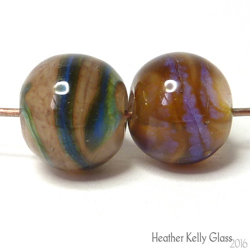
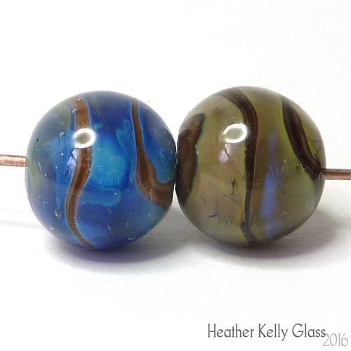
I did a little silver glass testing. First is a bead with a clear core, encased in Velveteen, with a stripe of Double Helix boreas. This was reduced (oxy down) and encased. There’s some darker brown fuming and the boreas is a lovely bright iridescent purple with some mottling.
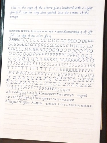
The second silver glass bead has okeanos instead, again reduced. It has ended up with a variety of colours, from yellow-green to light turquoise to deep blue, again with interior mottling. The stripe has remained thin and not expanded. In the centre of the bead, there is a pronounced dark line at the edge of the silver glass, bordered with a light greenish and the deep blue pushed into the centre of the stripe.
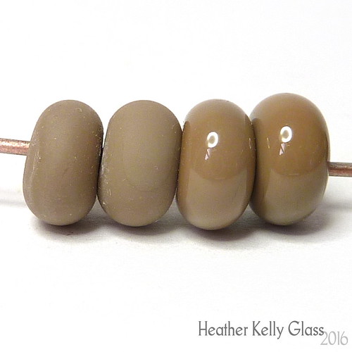
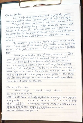
Toto
Toto is a soft milky brown with a touch of grey. My spacers came out a uniform colour. The etched pair look softer and lighter.
This pair of rounds have cores of 006 clear encased in Toto. One has a wrap of silvered ivory stringer which has spread and fuzzed at the edges. The surface has some darker grey areas. The second bead has two wraps of fine silver wire around the centre, melted in. It has fumed a dark brown line where the silver has melted in.
My sculptural gremlin is a fairly uniform colour on the front – it has some of the darker grey visible on the back and the soles of the feet, which are cooled swiftly when I flatten them.
Silver glass beads: core of clear, encased in Toto, spiral of silver glass which is reduced and encased in clear. The first bead uses boreas, which has not come out well – it is mostly a greenish brown with only the slightest patch of iridescent purple. The base is visible as a dark brown next to the boreas. The okeanos came out much better and has struck to blue-purples with green at the ends. The Toto shows through as a warmer brown with separation lines where it meets the okeanos.
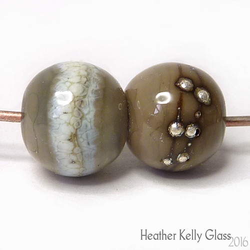
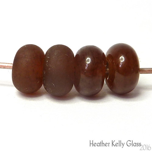
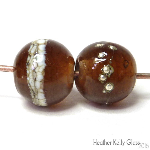
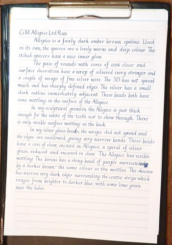
Allspice
Allspice is a fairly dark amber brown opalino. Used on its own, the spacers are a lovely warm and deep colour. The etched spacers have a nice inner glow.
The pair of rounds with cores of 006 clear and surface decoration have a wrap of silvered ivory stringer and a couple of wraps of fine silver wire. The SIS has not spread much and has sharply defined edges. The silver has a small dark outline immediately adjacent. These beads both have some mottling in the surface of the Allspice. (So do the spacers a little, but it isn’t so evident to the naked eye).
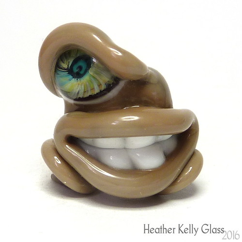
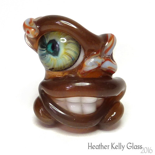
In my sculptural gremlin, the Allspice is just thick enough for the white of the teeth not to show through. There is only visible surface mottling on the back.
In my silver glass beads, the wraps did not spread and the edges and swallowed, giving very narrow bands. These beads have a core of clear, encased in Allspice, a spiral of silver glass, reduced and encased in clear. The Allspice has visible mottling. The boreas has a shiny band of purple surrounded by a darker brown – the same colour as the mottles. The okeanos has narrow very dark edges surrounding the centre stripe with ranges from brighter to darker blue, with some lime green near the holes.
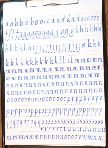
Handwriting
For anyone interested in fountain pens.
Here is my normal handwriting, where I composed the text. I can write reasonably straight without guides.
These were written with a recently-acquired Osmiroid 75 fountain pen with an italic extra fine straight nib. The ink is whatever was in the pen – I’d just added enough water to get it going and decided to write it empty because I just discovered piston fillers take forever to clean out by sucking up and expelling water… You can see it ran out during the third composition – I’d added more water but it was too faint by then so I finished cleaning it.
Here’s the first go – this was still with the old ink. I’d printed out some guide paper and this was the first time I’d used it. I was trying to get it all on one sheet (and failed) hence the lack of paragraph spacing. I was also putting one letter in each grid box, meaning my spacing is rather odd – the ‘m’s are very squished and some words are over-expanded. I used this calligraphy paper PDF generator printed out on my normal printer paper.
I aso realised I hadn’t practised capitals at all…
Second post: ink had run out so I refilled with Diamine indigo. The two look closer in the pics than they should – the original ink was a nice blue/blue-black and indigo has more of a steel grey tint in it. This time I used slightly smaller paper – 0.5 rather than 0.6mm nib size, and with halfway vertical guides too. I mostly ignored the guide boxes this time, just using them to go vaguely in the right direction and not for spacing. Also less obvious in the photo, it starts out with wetter writing so the letters are darker, then for the rest my writing angle must have changed, as I have drier writing and it also gets bigger. That was partly the fault of writing without bright enough light coming from the right direction, as I couldn’t always see the guidelines… The part at the bottom is darker and smaller again. I couldn’t work out how to write the correct s at that size – it’s supposed to be a narrow letter and it was very difficult not to write it wider.
Third: I went back to the bigger size but kept the extra verticals. It’s looking a bit better, though still various irregularities.
Some practise, may also show the ink colour difference a little.
Big practice, back with the Lamy Joy and 1.9mm nib. I managed the s shape once or twice at this size!