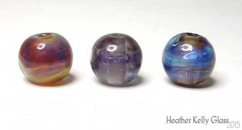
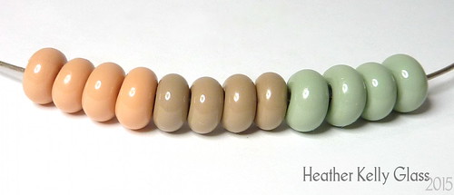
CiM colour testing: September 2017 greens, oranges, brown
(This post has been on my to-do list since September…)
From Creation Is Messy’s September limited editions, I went for the selection of greens, oranges and browns first.
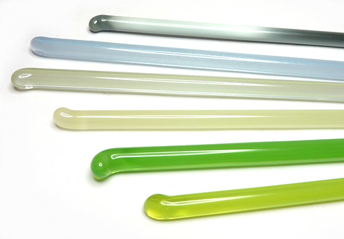
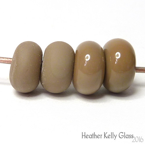
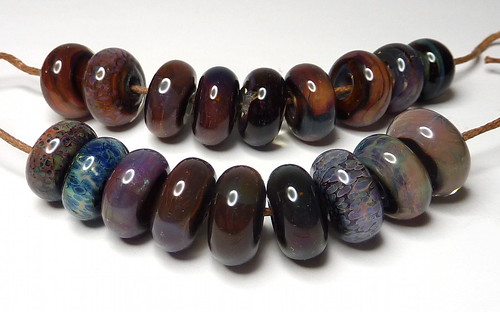
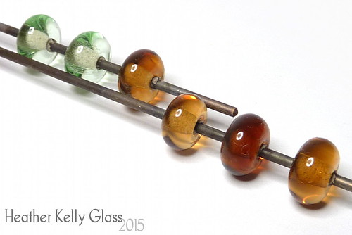
Here are the rods – we’ve got some striking going on here.
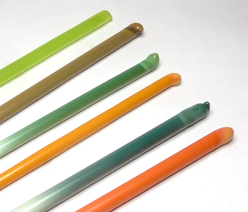
From the top: Jelly Bean, Canoe, Turtle Power, Monarch, Juniper, Harvest.
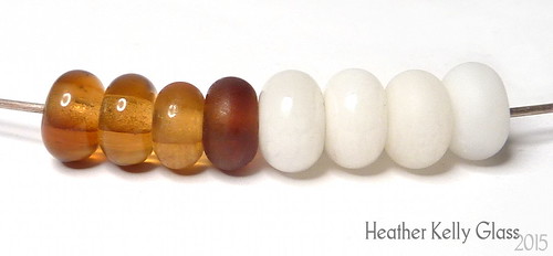
Pretty little barrels!
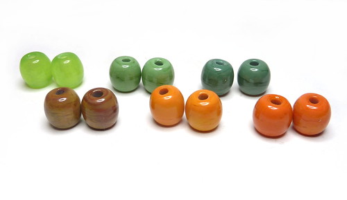
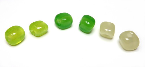
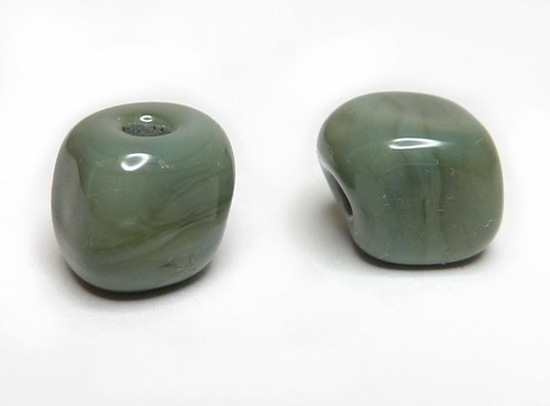
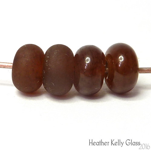
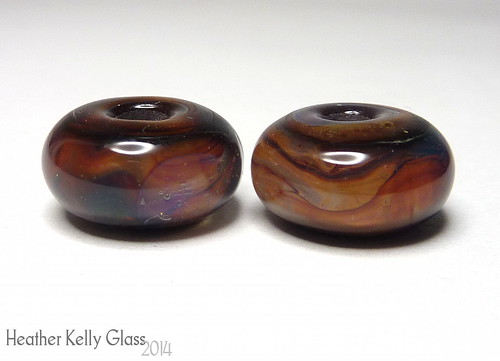
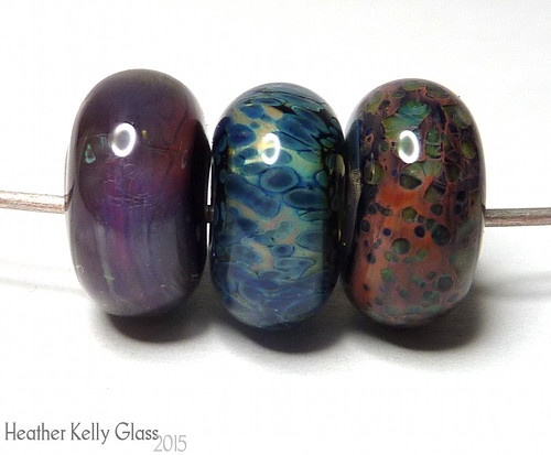
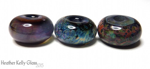
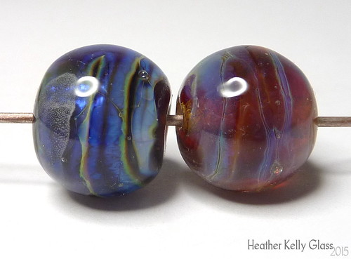
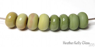
Greens
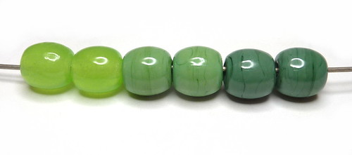
From left to right: Jelly Bean, Turtle Power and Juniper.
Jelly Bean is somewhat similar to Chartreuse in its glowing green, though is greener and less yellow, and is less transparent inside so the mandrel line is barely evident in these barrels. This is a soft colour when molten. Like many opalinos it can crack near the end of the rod when it cools, which is visible so you can melt it back in carefully when you next use the rod.
Turtle Power is indeed quite a turtly green. It is a middling green, neither bright nor muted, not too blue or too yellow. It comes out lighter than its rod and is streaky, as greens often are. Good organic kind of green. No rod issues.
Juniper is a darker, bluer green. Similar kind of tone – another good organic colour. Looks nice alongside Turtle Power, as they’re different enough to stand out next to each other. Again, it has darker streaks in it. I found the rod could be shocky when going back into the flame after cooling, and the first time in it peeled a bit at the cut end – it was fine when still a bit warm. When molten it was very smooth and viscous.
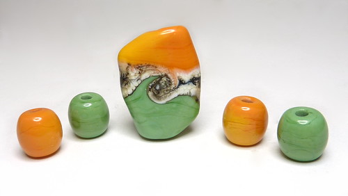
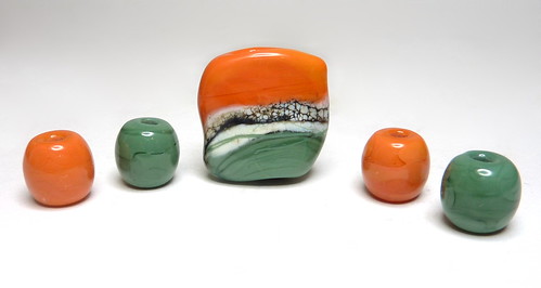
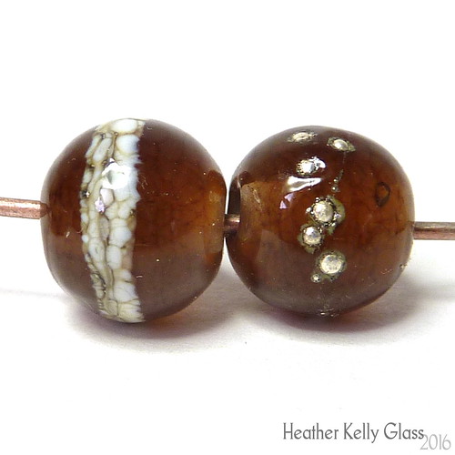
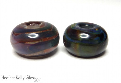
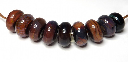
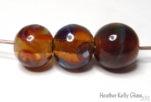
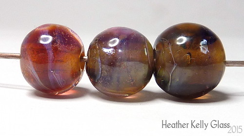
Orange and brown
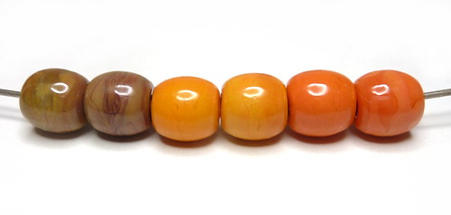
From left to right: Canoe, Monarch, Harvest
This trio of colours together makes me happy!
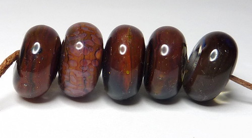
Canoe is a striking silver-rich brown like Canyon de Chelly and the ASK/Kugler browns. It has some lovely light and dark streaks, and can go a yellower or redder brown. The rod itself was exceptionally well-behaved, especially as I had a slightly thicker one. With silver-rich colours some shocking at the end is fairly usual, and nothing of the sort happened here.
Monarch is the lighter orange. The end of the rod has struck lighter still, but the beads have blushed more orange in places, which I love. Monarch had an air bubble running the length of the rod, so was a little shocky.
Harvest is a deeper creamy orange. It also has some darker and lighter struck areas, though is less pronounced than Monarch. The rod was very good at going in and out of the flame – no problems with cracking.
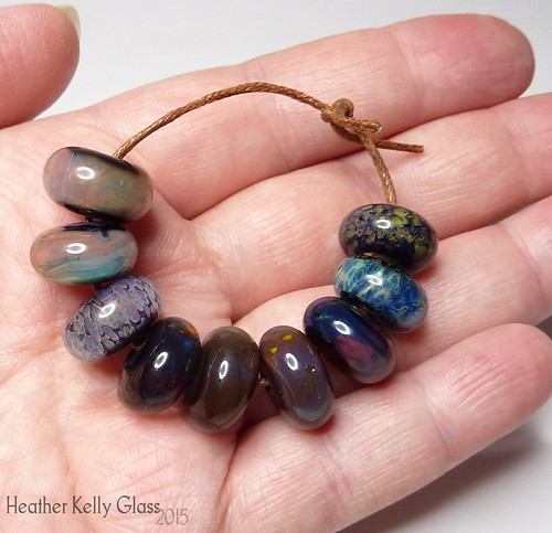
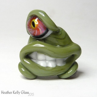
I did a pairing off that gave some nice contrasting colours.
Monarch and Turtle Power
You can see the difference between the yellower- and oranger-struck areas of Monarch better here. There’s a dark reaction line between the swirl of Effetre New Ivory on the focal bead and the green of the Turtle Power, as you’d expect. No line on the Monarch side, just a fuzzing out.
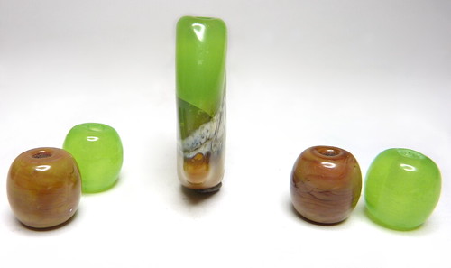
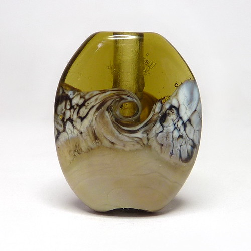
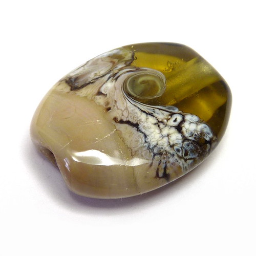
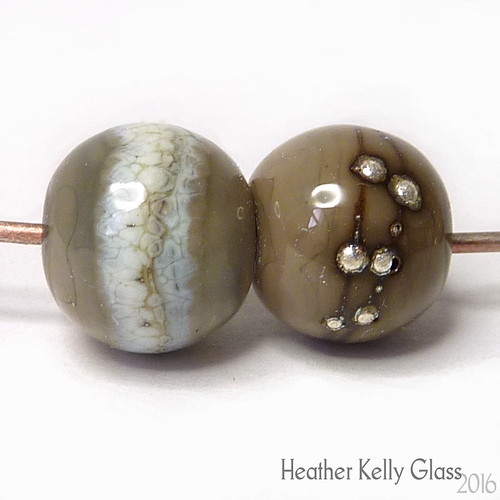
Jelly Bean and Canoe
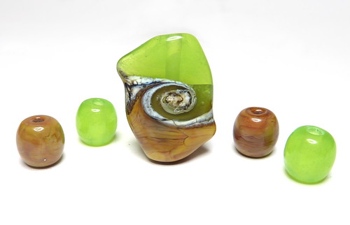
This pairing got a horizontal compatibility crack where the Canoe was deeply encased by the Jelly Bean, which is a shame as I really liked this colour combination. (I don’t think it was the New Ivory’s fault, though to be sure you’d need to test without it. An opalino over a silver-rich glass is a risky proposition). Replace with a transparent green for safety here, I guess. You can see the variety of shades the Canoe can get. When adding the New Ivory, it seemed to spread into the Canoe and not into the Jelly Bean. It has added some especially dark caramel tones on the border with the Canoe. You can see the mandrel line in the pressed Jelly Bean, but still see how far from transparent it is – gooey and misty.
Side view:
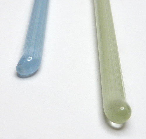
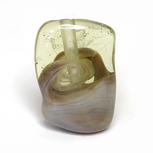
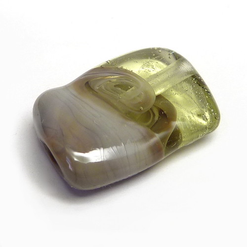
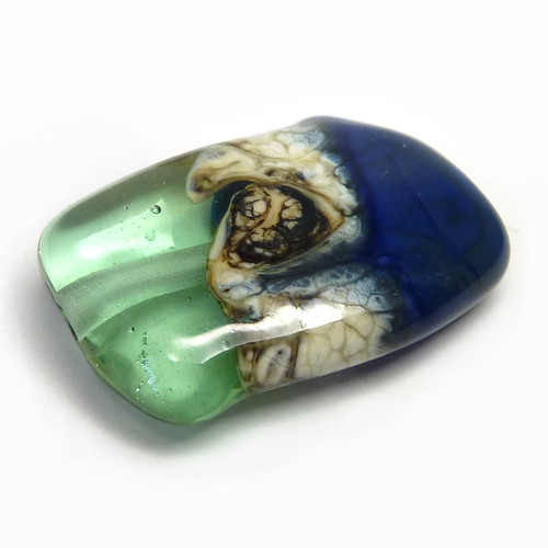
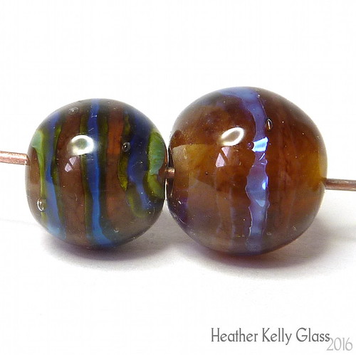
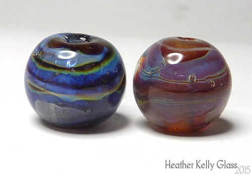
Harvest and Juniper
Nice combo – the more muted Juniper isn’t fighting with the bright Harvest. Handy pumpkin colours. There’s quite a lot of black webbing in the New Ivory and a dark line between it and the Juniper in only some places.
CiM colour testing: February 2017 colours
The spring 2017 limited editions from Creation is Messy had a whole load of transparent greens, and a whole load of opaque grey rods.
To start with, I picked out the first few colours that appealed to me (those greens!), along with a couple I thought would go with them.
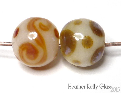
Chartreuse
Chartreuse (left) is a luridly bright light yellowy green which I love.
Inchworm
Inchworm (middle above) is another bright juicy green that is more transparent than CiM’s Poison Apple, which is a more standard opalino and can strike lighter and more opaque. Inchworm (like chartreuse) didn’t opacify at all and remained a lovely uniform misty transparent.
Cornsilk
I also love this colour (right beads), which is a uniform opalino beige. It is less streaky than Reichenbach’s mystic beige or pearl beige, and has a nice amount of translucency. Again, it does not seem to strike lighter or more opaque when worked for longer.
Yangtze and Sea Mist
I am in two minds about Yangtze and Sea Mist. They are full of micro bubbles and the end of the rod boils very easily, both of these leaving bubbles that don’t go away. The rods themselves look faintly striped inside. I would normally dismiss these as poor quality glass, but I do really like the way the nuggets look – it is different from an opalino, or an etched bead, or from baking soda bubbles. They are muted non-uniform colours which are quite different from the rest of the palate. I think they would do well to pair with or mimic semi-precious beads which have cloudiness or inclusions, where most transparent glass beads alongside those look too brash and uniform in colour. So if you have a very specific use-case, these might be useful. I think I’d buy them if they weren’t too expensive, because I do have a lot of semi-precious beads I think they would go well with (labradorite, blue lace agate and so on).
Troll
Troll is an opaque muted grey-green that is not unlike various of CiM’s other colours, but is still a type I like and find useful. I picked it as an opaque to go alongside these other colours for the two-tone beads below. It does strike greener than it appears on the rod, which is more of a blue grey.
All the nuggets!
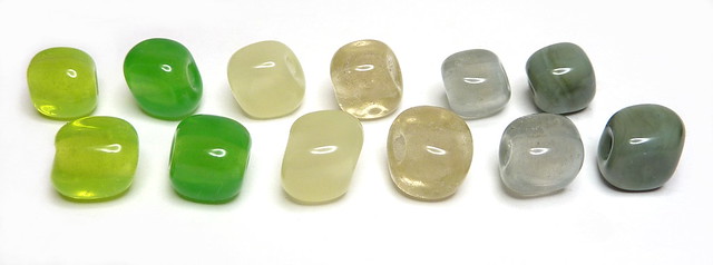
Aren’t they pretty just on their own?
Two-tone critters
Troll and chartreuse above.
Inchworm and bubbly yangtze above. I do like the colour fade from one to the other.
Cornsilk and very bubbly sea mist above.
You can see an area of Sea Mist that boiled on the rod on the back of this bead. For use in a non-organic bead this is a no. For one that is, there’s a possibility you might want to do this on purpose. (Again I like the transition from one colour to the other).
Troll and sea mist above.
Cornsilk and chartreuse above.
For the rest of the colours, I decided to do organic beads, and paired them up for this.
Peat Moss and Safari
Peat Moss is a suitably brown-olive transparent green. I trapped a couple of bubbles but on the whole it is very clear.
Safari looks greyish in the rod, and not having looked them up beforehand, I was very surprised that it immediately struck to a light sandy brown! The bead coming out of the kiln is more uniform than it looked going in, but you can still see a darker brown in one corner below.
I put a wrap of Effetre New Ivory across the transition and twisted it. It is a very handy insta-silvered-ivory rod and I really like the way it came out.
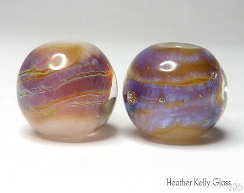
Peridot and Van Dyke Brown
Peridot is a pale transparent yellowish green. It does bubble quite easily, but they mostly ended up like tiny champagne bubbles here rather than scum, so don’t look too ugly.
Van Dyke Brown is like Safari but darker and greyer. This bead has kept a bit more of the colour variation (but on the light side) so we have a pale milky grey and a warm brown, with some transition areas of yellow and cooler darker grey. It remains streakier than Safari did.
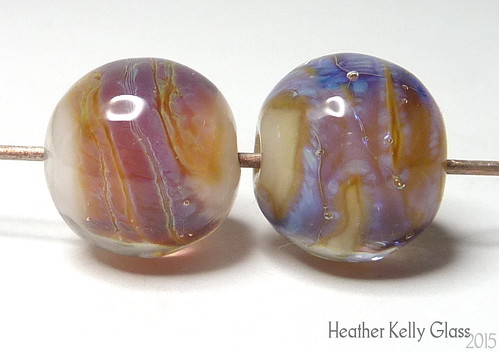
Eel Grass and Pachyderm
Eel Grass is a midtone green. I got a few bubbles again but not too many.
Pachyderm is a grey-brown that has streaks and variations that are less extreme than the previous two. It has come out distinctly warmer and browner than the rod here. (I like these types of greys – CiM has had quite a few of them now).
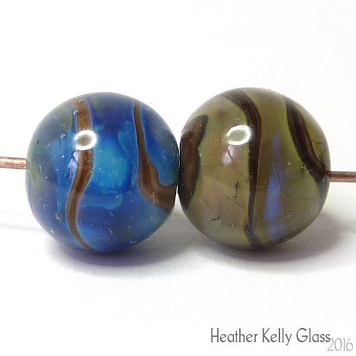
Refresh and Prussian Blue
Refresh is a very pretty pale green-aqua (and I think it looks great here!).
Prussian Blue is a dark easily-mottled streaky blue that will strike greenish. Here it has stayed mostly blue.
I added Effetre New Ivory again and I love the combination of all three colours.
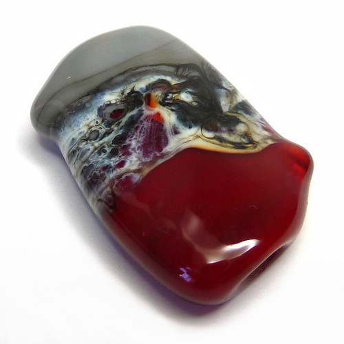
Hemoglobin and Koala
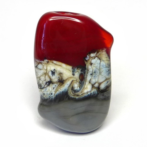
Hemoglobin is a semi-transparent red (only the little nub on the side has remained particularly transparent).
Koala is the actually grey one out of all these grey-looking rods. It has striated here next to the New Ivory and produced strong dark lines but from the bottom of the bead looks like it would stay pretty uniform away from that.
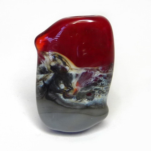
There’s an interesting bit here where the New Ivory is underneath and thin on top of the red (and over-reacted on top of the koala).
Okeanos tests
Finally, I did a pair of tests with Safari and Van Dyke Brown as the most reactive colours, combined with silver glass Double Helix Okeanos.
For these beads I had a central cylinder of the brown, a cap of okeanos on each end with little brown dots, and a wrap of okeanos around the centre on top of the brown. (The colours of the okeanos make it look like it is below the browns, which isn’t the case. You may need to stare at it a little!)
In this first bead with Safari, the central okeanos wrap has spread to be very wide. There are dark lines and interior reaction lines in the Safari (the latter particularly obvious in the dots).
The Safari has struck a bit darker than before, which you would expect, but there is plenty of lighter shade left. Okeanos has produced its pretty blues and greens easily.
Now for Van Dyke Brown.
Here, the central band of okeanos has been swallowed somewhat by the surrounding brown, making it much thinner than the previous bead. The Van Dyke Brown has struck browner than before, and only has grey in the dark reaction lines.
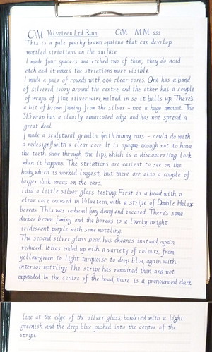
CiM colour testing: Velveteen, Toto, Allspice
These were the new CiM limited edition colours out in spring 2016. I am somewhat behind on writing this post as Flame Off happened…
Also, I got into fountain pens recently, and decided to use my post to practise my italic handwriting so that I got both the thing I had to do and the thing I wanted to do done. Pics thereof at the bottom.
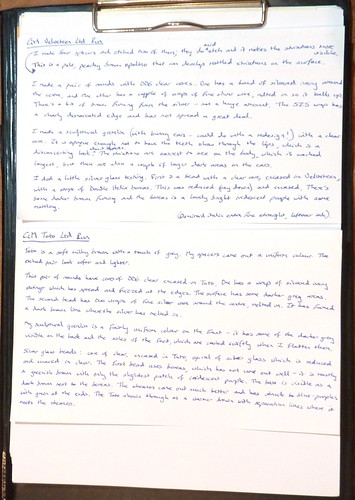
Velveteen
This is a pale peachy brown opalino that can develop mottled striations on the surface. I made four spacers and etched two of them; they do etch and it makes the striations more visible.
I made a pair of rounds with 006 clear cores. One has a band of silvered ivory around the centre, and the other has a couple of wraps of fine silver wire, melted in so it balls up. There’s a bit of brown fuming from the silver – not a huge amount. The SIS wrap has a clearly demarcated edge and has not spread a great deal.
I made a sculptural gremlin (with bunny ears – could do with a redesign!) with a clear core. It is opaque enough not to have the teeth show through the lips, which is a disconcerting look when it happens. The striations are easiest to see on the body, which is worked longest, but there are also a couple of larger dark areas on the ears.
I did a little silver glass testing. First is a bead with a clear core, encased in Velveteen, with a stripe of Double Helix boreas. This was reduced (oxy down) and encased. There’s some darker brown fuming and the boreas is a lovely bright iridescent purple with some mottling.
The second silver glass bead has okeanos instead, again reduced. It has ended up with a variety of colours, from yellow-green to light turquoise to deep blue, again with interior mottling. The stripe has remained thin and not expanded. In the centre of the bead, there is a pronounced dark line at the edge of the silver glass, bordered with a light greenish and the deep blue pushed into the centre of the stripe.
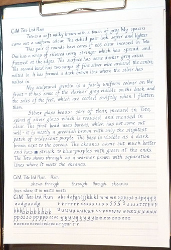
Toto
Toto is a soft milky brown with a touch of grey. My spacers came out a uniform colour. The etched pair look softer and lighter.
This pair of rounds have cores of 006 clear encased in Toto. One has a wrap of silvered ivory stringer which has spread and fuzzed at the edges. The surface has some darker grey areas. The second bead has two wraps of fine silver wire around the centre, melted in. It has fumed a dark brown line where the silver has melted in.
My sculptural gremlin is a fairly uniform colour on the front – it has some of the darker grey visible on the back and the soles of the feet, which are cooled swiftly when I flatten them.
Silver glass beads: core of clear, encased in Toto, spiral of silver glass which is reduced and encased in clear. The first bead uses boreas, which has not come out well – it is mostly a greenish brown with only the slightest patch of iridescent purple. The base is visible as a dark brown next to the boreas. The okeanos came out much better and has struck to blue-purples with green at the ends. The Toto shows through as a warmer brown with separation lines where it meets the okeanos.
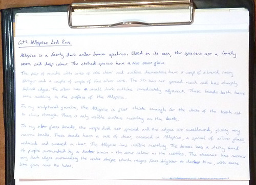
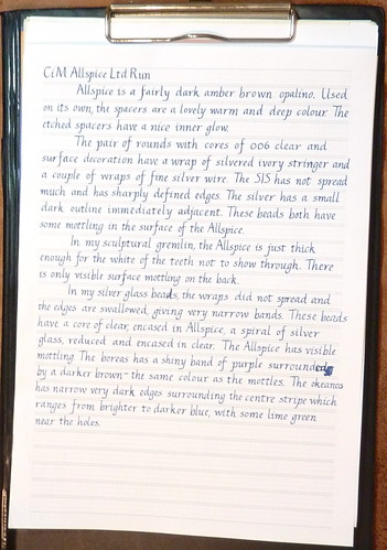
Allspice
Allspice is a fairly dark amber brown opalino. Used on its own, the spacers are a lovely warm and deep colour. The etched spacers have a nice inner glow.
The pair of rounds with cores of 006 clear and surface decoration have a wrap of silvered ivory stringer and a couple of wraps of fine silver wire. The SIS has not spread much and has sharply defined edges. The silver has a small dark outline immediately adjacent. These beads both have some mottling in the surface of the Allspice. (So do the spacers a little, but it isn’t so evident to the naked eye).
In my sculptural gremlin, the Allspice is just thick enough for the white of the teeth not to show through. There is only visible surface mottling on the back.
In my silver glass beads, the wraps did not spread and the edges and swallowed, giving very narrow bands. These beads have a core of clear, encased in Allspice, a spiral of silver glass, reduced and encased in clear. The Allspice has visible mottling. The boreas has a shiny band of purple surrounded by a darker brown – the same colour as the mottles. The okeanos has narrow very dark edges surrounding the centre stripe with ranges from brighter to darker blue, with some lime green near the holes.
Handwriting
For anyone interested in fountain pens.
Here is my normal handwriting, where I composed the text. I can write reasonably straight without guides.
These were written with a recently-acquired Osmiroid 75 fountain pen with an italic extra fine straight nib. The ink is whatever was in the pen – I’d just added enough water to get it going and decided to write it empty because I just discovered piston fillers take forever to clean out by sucking up and expelling water… You can see it ran out during the third composition – I’d added more water but it was too faint by then so I finished cleaning it.
Here’s the first go – this was still with the old ink. I’d printed out some guide paper and this was the first time I’d used it. I was trying to get it all on one sheet (and failed) hence the lack of paragraph spacing. I was also putting one letter in each grid box, meaning my spacing is rather odd – the ‘m’s are very squished and some words are over-expanded. I used this calligraphy paper PDF generator printed out on my normal printer paper.
I aso realised I hadn’t practised capitals at all…
Second post: ink had run out so I refilled with Diamine indigo. The two look closer in the pics than they should – the original ink was a nice blue/blue-black and indigo has more of a steel grey tint in it. This time I used slightly smaller paper – 0.5 rather than 0.6mm nib size, and with halfway vertical guides too. I mostly ignored the guide boxes this time, just using them to go vaguely in the right direction and not for spacing. Also less obvious in the photo, it starts out with wetter writing so the letters are darker, then for the rest my writing angle must have changed, as I have drier writing and it also gets bigger. That was partly the fault of writing without bright enough light coming from the right direction, as I couldn’t always see the guidelines… The part at the bottom is darker and smaller again. I couldn’t work out how to write the correct s at that size – it’s supposed to be a narrow letter and it was very difficult not to write it wider.
Third: I went back to the bigger size but kept the extra verticals. It’s looking a bit better, though still various irregularities.
Some practise, may also show the ink colour difference a little.
Big practice, back with the Lamy Joy and 1.9mm nib. I managed the s shape once or twice at this size!
Boro colour investigations: NS Aurora
In the GBUK Journal Issue 7 (out April 2015) I had an article showing the results I got from making sets of simple test beads with a range of boro colours from Northstar (NS), Momka, Trautman Art Glass (TAG) and Glass Alchemy (GA). The idea was to give beadmakers new to boro some idea of what the various colours *could* look like, since the paddles aren’t that useful and beads look different from implosions or blown work. There’s still huge variation possible with some colours, but it’s a start!
I work on a Minor and a 10lpm oxycon.
I’m continuing my results here. That article was on beads only, but I’ll be adding implosions, pendants and anything else in here too as I experiment.
First up is a colour that took me a great deal of prodding until I understood how to work it better. I’d read the working notes, then mostly forgotten them when I made the first set of beads.
Northstar Aurora
These are my first five beads. They all have a clear core. From left to right:
• aurora, encased in clear;
• aurora with clear frit, encased in clear;
• aurora over white, encased in clear;
• aurora over black, encased in clear;
• aurora on surface.
They are mostly brown/tan with a little dull pinky-red and slight hints of purple. On the surface I got the rod colour, which is almost black. They went through my normal kiln schedule which has a striking segment at 621C (1150F) for 10 mins and anneals at 565C (1049F).
They aren’t bad for brown, but I did know aurora was supposed to do more than that. I made a couple more, trying very hard to strike them: still browns.
So I went back to the notes. Northstar newsletter #1 says:
For NS-47 Aurora it is also possible to get a full spectrum of colors depending on which flame is used as well as whether the pieced is encased in clear or a color. To achieve vibrant blues, try working it in a highly oxidizing flame. To yield a green, work it in a neutral flame. To generate vibrant deep reds, work the piece in a neutral flame then reduce the piece when it is close to completion.
(Northstar newsletter #18 mentions using aurora as a backing colour for amber purple and others).
I tried for the high oxy flame. That’s a challenge on oxycons, even a large one, so for a while I wondered if my enough-oxy-to-be-hissing flame wasn’t even neutral, as the more I did, the more my beads remained rod colour.
I turned my oxy up as high as I could get it and the propane down a little for the hissing flame. I made these two beads. To get the lighter areas I had to really blast the surface and then allow to air cool for a long time. I still couldn’t get the whole bead light. The light areas looked greenish before encasing and going in the kiln, but came out like this.
I then made an encased stringer, which looks a dull green with occasional pinker sections (see below). These beads were made with the stringer – the blue stripe on the black bead was where the stringer was encased – I used the end left on the rod, so the black is the unencased glass. The other bead went purplish in the kiln – still very dark.
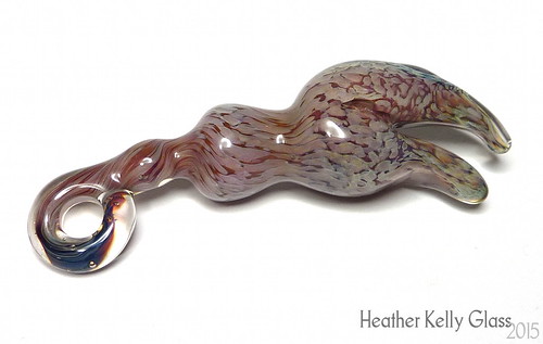
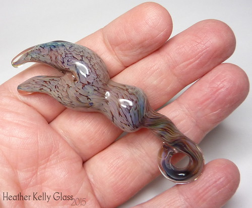
I decided to do something a bit bigger next and with no mandrel in the way, so made a pair of scorpion claws.
One claw is solid aurora – still an awful lot of brown-black even for something with a much longer working time that was going in and out of the flame. I used a fairly high oxy flame but also enough propane to let me melt easily. For the second claw, I made a gather of aurora, encased it and then did all the shaping. It looked lighter before it went in the kiln, but came out weirdly salmony with other areas – a few dark blue-purple bits, a little almost-green haze. These were annealed with no striking segment, so at 565C all the way.
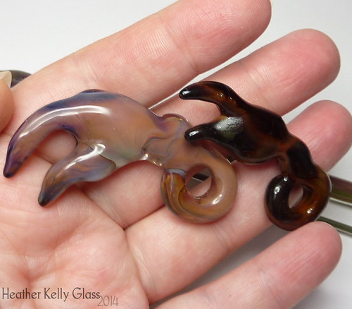
(The natural colour is pretty good for a scorpion).
This shows the encased stringer too.
Then I found this video clip by Milon Townsend on Firelady’s site, showing that when worked in an oxy flame aurora does indeed remain rod colour! So that was working. He gets a bright red-pink from an entirely reducing flame, no encasing.
I hadn’t been reducing it because
1) I try to work all my first bead sets in roughly the same flame so they can be compared.
2) I was trying for the greens in the Northstar newsletter, which said use a neutral flame. That note leaves out any mention of reducing it after working, apart from getting reds.
For my next beads, I melted my glass entirely in a reducing flame – I got opaque salmony pink showing up on the tip of my rod, which vanished on the bead, but rolling the bead in the edge of the flame made the surface lighten up, and then after encasing it definitely looked different. I also added a new program that doesn’t go above 538C, from a recommendation that it would stop aurora striking browner.
Here is what my rod looked like:
And this is what I got:
The bead on the left was less reduced than the others and has come out one of those odd in-between colours that I will call taupe. Not very pretty, but different from what I was getting before. I reduced the middle bead enough to get an opaque surface then encased it – I got seagreen along with the salmon pink! The right bead is again reduced a lot, then rolled in clear frit and encased – it has gone purple under the frit and is quite pretty. Progress!
When I say reduced a lot, I had my flame so I just started getting about 2mm of yellow bushy ends on my candles. Get the rod end or bead surface properly hot in this and you’ll see the surface change after a moment or two- that’s when it develops the opaque salmon colour. It’ll tend to go away while forming the bead (even in the same flame) and you’ll have to bring it back again on the surface once you have it shaped.
I went on to make a pair of off-mandrel hearts after that.
The base is TAG Red Elvis. I added a spiral of aurora round it, added in a reducing flame. In this one I added clear frit when the aurora was still raised, melted it in in a reducing flame, then encased in clear. (I didn’t pull the heart into the best shape here, wasn’t sure which direction to go in!)
That’s the other side.
You can see I got a band of green and yellow on one lobe and various other colours, with a good bit of salmon pink and red from the glass that wasn’t under frit. The colour is a little muddy in areas, especially centre back. The area on top of the lobes was added last, worked least, and has the brightest colour. I’ve also got haze spread across the red Elvis areas, which looks pretty cool with the frit on top.
My second heart was a lot bigger. This has a clear core under the red and has a bit of TAG sparky inside too, though you can’t see it much unless you peer (sparky is a dense sparkle – mix it with anything to thin out).
The aurora was all added to the gather at the same time and melted down fully before the frit was added. I prefer the colours I got the first time as these are more muted. It was also worked longer. The shape is greatly improved though!
I went on to make this trio of beads where I tried a lighter hand with the reduction – that didn’t work and I got tiny hints of colour but mostly dark. The little yellow spots are where metals came to the surface. I was trying to brush lightly with the edge of the reducing flame and it really didn’t do much.
Finally, I made these three.
From left to right:
1. Formed in neutral flame, heated through in reducing flame once so it went iridescent not opaque, encased. It went a good purple.
2. Reduced a lot, added clear frit, reduced more and encased – I got blue-green and yellow, plus slightly purple round the other side.
3. Reduced a lot, added clear frit, not encased. Red and green, and yellowish round the back, which lost the surface pink.
That is quite a difference from one glass!
Here are the beads in hand, slightly washed-out, but it shows the yellowy-green back on the last bead.
Here are the earlier beads together.
And here ALL the beads!
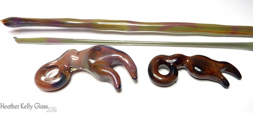
I went on to make another large claw.
I encased a gather of clear with aurora, reduced and added the clear frit, reduced again and encased in clear. Then I did the shaping. I got a generally more uniform colour here, mostly pastel mauve though some hints of blue and green also.
The colour is less eyecatching again, but quite pleasing.
I made a scorpion tail, intended to be brown and black this time!
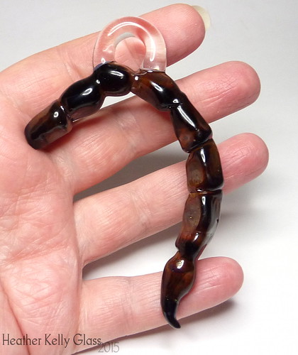
(This took a long time and is quite fragile because of the nature of the segment joins – I promptly dropped it a short way when taking it out of the kiln, broke it in three and had to fix it. It needs some more construction thought or deliberate smoothing of the segments into each other).
I tried imploding aurora in a jellyfish pendant.
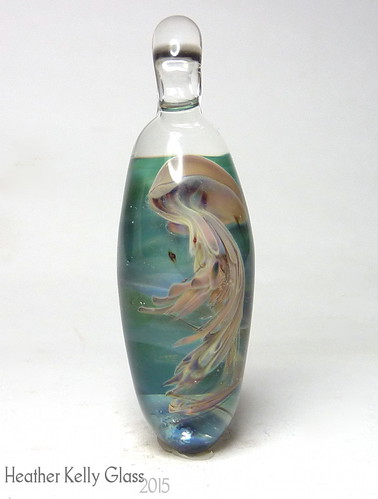
This came out mostly a warm peachy tan, with hints of all sorts of colours in it. The background is NS blue moon, of which more later.
In conclusion, aurora took quite a lot of work to begin to understand but I do not regret it!
Here are a few posts and pieces by other people I tracked down to give me hope that you could actually get other results from it:
• Proof aurora goes green! By Heather/Ericaceae.
• Pretty muted multicoloured beads by Suzanne (scroll down).
• Darker red/green/blue heart by e. mort.
• Brighter blues and greens heart by e. mort.
• Discussion of annealing temp to avoid purple aurora going brown (no pics).
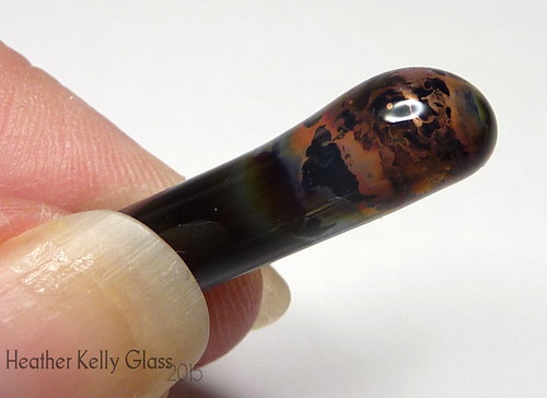
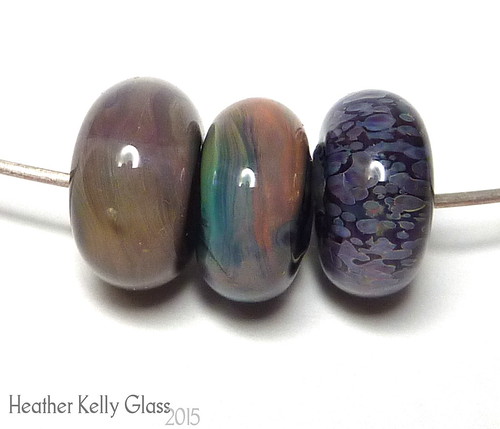
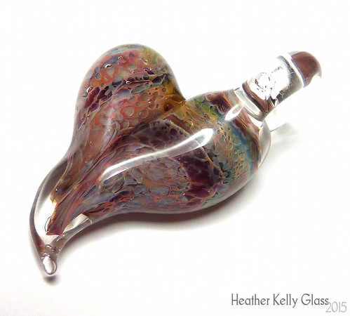
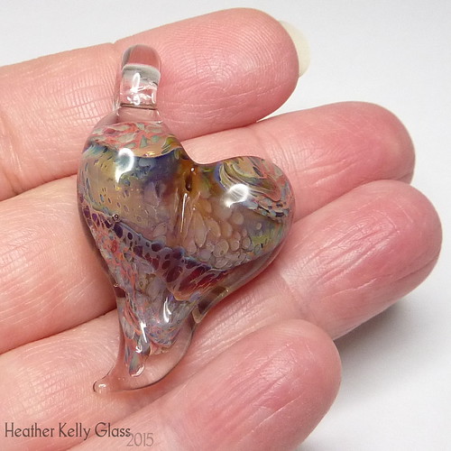
CiM colour testing: Indian Summer, Dirty Laundry and a little more Ogre
Indian Summer
Indian Summer is an interesting one – it’s a striking amber.
I took an on-mandrel pic to show the striking.
Here are Indian Summer and Dirty Laundry spacers. Indian Summer didn’t etch particularly consistently – the very dark bead appeared to etch more. Dirty Laundry is an opal white, and looks as expected here.
I expected both of these colours to be reactive so had hope for the silver glass results.
The bead on the right here shows that Indian Summer is not good as a surface encasing colour – it just gets too dark, especially as this bead had a core of Indian Summer as well. The silver glass in that one was Luna 2.1 which is mostly transparent and you can just see some streaks round the middle. The other two beads had a core of 006 clear, encased in Indian Summer, then Luna 2.1 scrolls on the left and Boreas dots in the centre bead. Both promising: the Luna 2.1 scrolls have sharp light edges in some places and fuzzier edges but a defined centre in others – those are the purpler more transparent areas. The Boreas dots have a concentrated very shiny centre, then a ring where it appears the Indian summer has displaced it, then an outer ring which has a shiny area and then a dark sharp outer line.
I then did a pair which have an Indian Summer core, a spiral of silver glass and encased in 006. Very interesting! Boreas is on the left – the core looks extremely dark and the boreas is a dark blue with bright green edges fading to brown. (Ignore the grey bubbles at the bottom – the end of my clear was dirty and I didn’t notice until too late).
The Luna 2.1 bead (right) is the usual pinky-purple and has developed blue-green lines and haze in the centre of each spiral. The edges of the spiral are the lighter amber areas.
Dirty Laundry
Luna 2.1 scrolls on the left, Boreas dots on the right. Both colours get some slight outlining effects, but what is most interesting is the different ways the base has fumed in each case. Under the Boreas, the Dirty Laundry has gone a cold yellow-green, while under the Luna 2.1 it has flushed a warm colour. (Boreas isn’t a great colour to put over pale white or tan opaques because as a transparent purple it will always show brownish).
These next two are fabulous though.
These are both encased in 006. The silver glass in both cases has a mottled and feathered look with noticeable edges. The Boreas on the right is blue-purple and the Dirty Laundry underneath has fumed a darker caramel brown. The Luna 2.1 bead on the left is lovely. The silver glass has again formed dark then light lines in the centre, and the darker amber lines are the gaps between the spirals. The Dirty Laundry hasn’t fumed very far though, leaving cloudy white ends which I love.
Here you can see the Dirty Laundry parts of the Boreas bead – they have still fumed somewhat tan and have darker outlines rather than the fuzzy ones with the Luna 2.1.
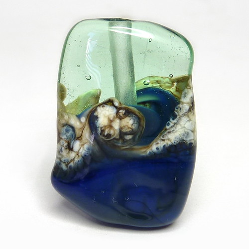
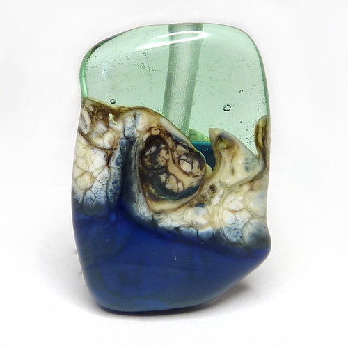
Ogre
Finally, a silver glass pair on Ogre.
Luna 2.1 scrolls and Boreas dots, as before. You can see slight separation lines around the edges of the scrolls, and the Boreas dots are again very shiny and have sharp brown rings around them. Around the beadholes has also tended to go brown. Quite interesting for organic beads.
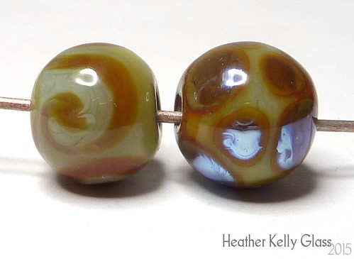
CiM colour testing: Charlotte and Limelight
These are both very pretty transparents.
Limelight is a clean, cool green with no hints of yellow. Charlotte is a warm pink that is saturated enough to hold its own. I don’t think we’ve had anything else in 104 quite this colour (not counting CiM’s Paris, out at the same time and very similar). Both have a tendency to develop microbubbles, especially Charlotte – if you heat them further out they may get fewer.
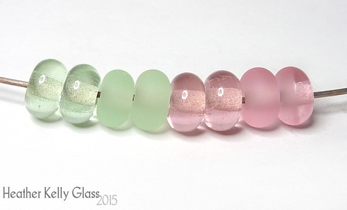
(The last Charlotte spacer was half out of the etching liquid on this side – I left it like this because I liked it).
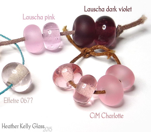
Here’s a comparison with a couple of other pinks I had to hand – Lauscha transparent pink is a baby pink and cooler in tone than Charlotte. I think the very pale one is Effetre rose quartz 067 – it is definitely Effetre, and their transparent pink tends to be a little peachier most of the time. You can see how well the colour shows in the etched Charlotte. I’d call this a cherry blossom colour. (The dark violet is just there because it was on the same string as the pink).
I then tried encasing silver glass with these transparents. I’ve been using Boreas for this for a while – it is a transparent reducing purple. This time I also added Luna 2.1 which is a mostly transparent striking colour.
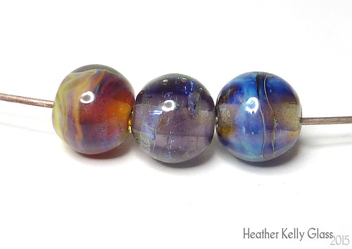
This is a core of clear encased in Double Helix Luna 2.1 (left) and Boreas (middle and right) encased with limelight. I did two with the boreas because I had an insufficient reduction moment with the middle bead. The limelight is pale enough that you don’t notice it much. There’s some good electric blue from the boreas on the right, and you can see the range of striking that Luna gets, from opaque yellow to transparent pinky purple. Probably not the best use for limelight, just because you can’t really tell it is there and it doesn’t appear to be affecting the silver glass.
Above is a second view of the limelight beads.
I did the same thing with Charlotte – this time I did two Boreas beads because the thicker encasing on the rightmost bead just ended up a murky green-brown. The middle bead has a thinner encasing and you can see some hints of pink at the top, while over the most reduced areas it is still the weird greenish colour. Silver tends to fume pinks brown – I don’t think I’ve ever tried similar with a transparent pink before. Luna 2.1 on the left is a better match – the pretty pink wisps inside go with the encasing. On the whole, you probably want this glass to look like itself rather than use it with silver glass though. (You can also see some areas of the microbubbles on these beads – once they’re there, you can’t get rid of them).
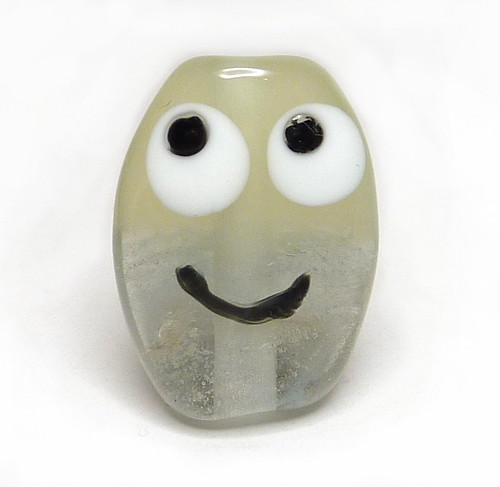
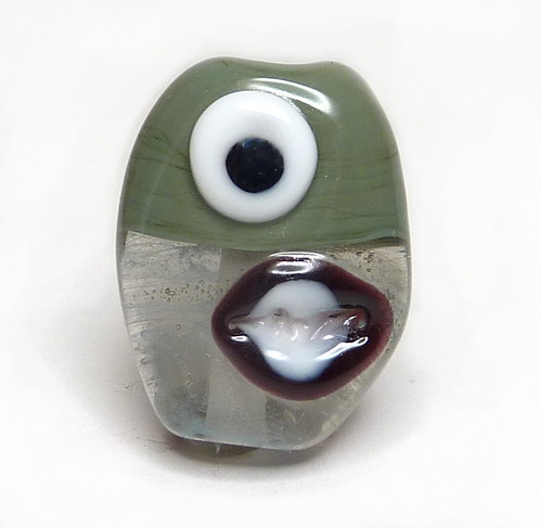
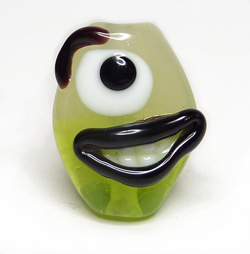
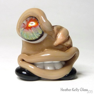
CiM colour testing: Ogre, Leaf Men
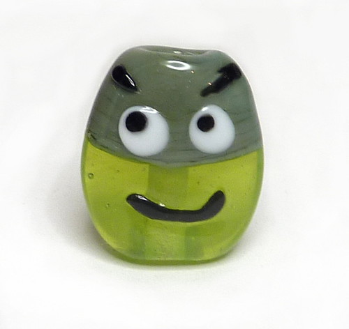
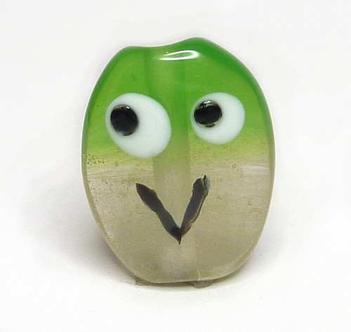
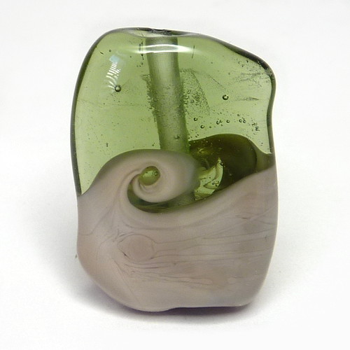
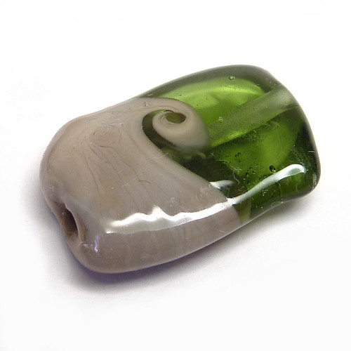
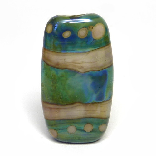
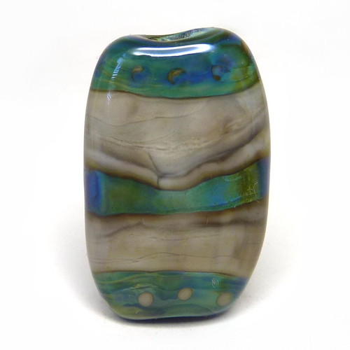
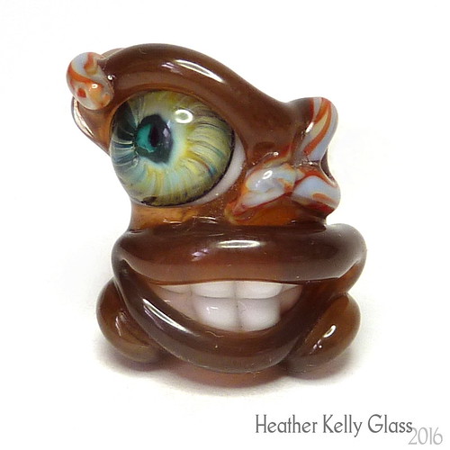
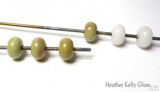
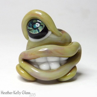
Continuing my writeup of the September batch of new CiM colours, here are a pair of opaque greens: Ogre and Leaf Men.
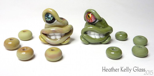
Ogre was a remake of Tortoise that came out an entirely different shade – I must say, I love it more than Tortoise. The light green and warm brown it develops are a lovely autumnal combo, cleaner than the purple that Tortoise gets.
I took a picture on the mandrel so you can see how the spacers struck. (Making more than three spacers of this size on a mandrel does not work for me – if I do more and let the early ones cool, one or two will crack, no matter how careful I am not to let the flame brush the first ones. So I do the ‘keep all three warm’ method and they survive). On the mandrel with three Ogre beads, the one nearest the end went into the kiln a light grey-blue, which is the colour this looks when not struck at all – it went green in the kiln.
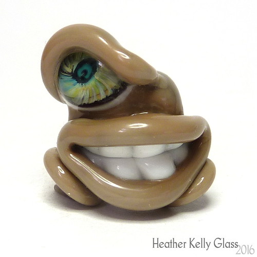
Ogre gremlin on its own: multiple strikings on areas has given the pinkier brown.
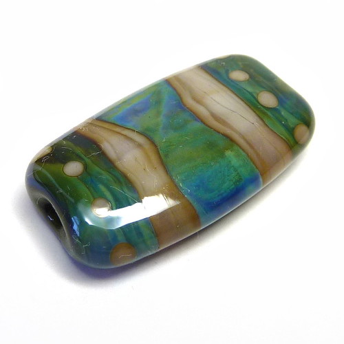
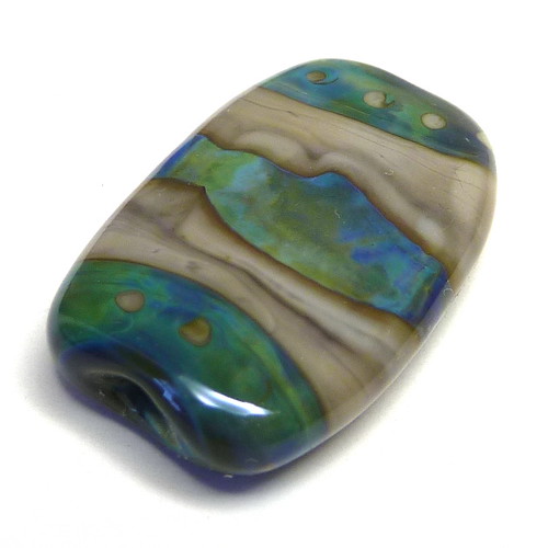
Ogre and Leaf Men spacers side-by-size. Ogre is lovely and soft etched.
Leaf Men is streaky as you would expect from green and nicely… leafy. Not bright, not olive.
Leaf Men gremlin:
Sewing: BoC bags
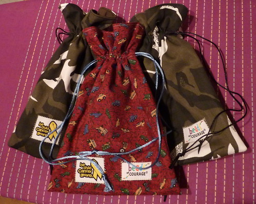
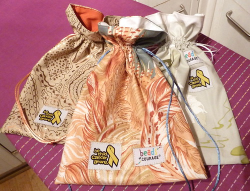
Here are some more bags for Beads of Courage that I made in October.
Two in green camo-print and another red car bag.
Here we have a swan, a blue and peach swirly feathery design (I have a fair bit of that, in odd-shaped long thin pieces – it’s an 80s possibly-wax-print fabric), and a gold on beige patterned bag. I really love the way that one looks with the burnt orange I used to line it.
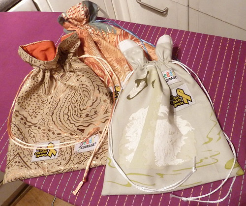
Rearranged so you can see the feathery one.
I’ve just received some Designers Guild kids range samplers (also Scrapstore), and there are some really lovely and cute pieces in there, so I will be making bags from those next.
I also made myself a new pincushion – since I have two sewing machines now, I keep finding my pincushion is at the wrong one… (My current pincushion is one I made at primary school – two squares of felt hand-sewn together). This is a Scrapstore fabric that I’m hoarding somewhat since I love the design, suns and planets on red – I decided to use a little bit of it to make something for me.
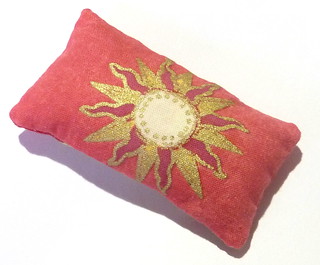
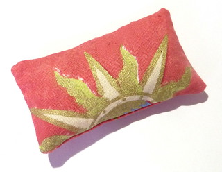
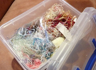
I stuffed it with thread offcuts – I keep those along with trimmed frayed edges and other tiny little unusable scraps in a box for this kind of thing.
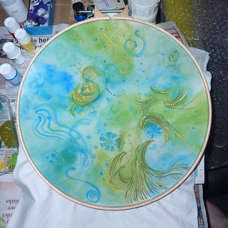
I also did a little experimenting with fabric paints – the ones I used here are Pebeo paints, but I also have medium to add to my normal acrylics, and I have some Procion dyes. Paint sits on top of the fabric so makes it stiffer – I thought of using dye for most of it and then possibly adding thin lines for illustration with paint, if I want to illustrate it. I was just doodling with this to see how the paint worked. (White fabric also from the Scrapstore). The frame is a quilting hoop that is very handy for this – I noticed that The Works had small hoops when I was there, so got a pair of those too for smaller pieces of fabric.
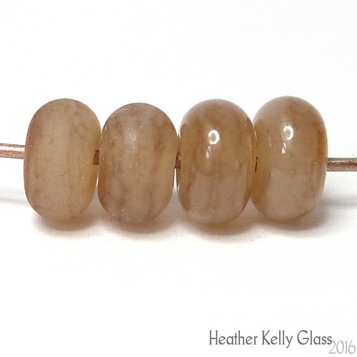
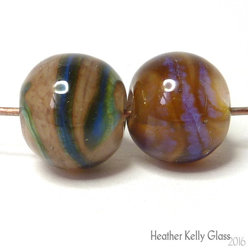
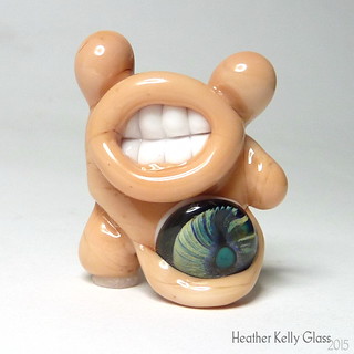
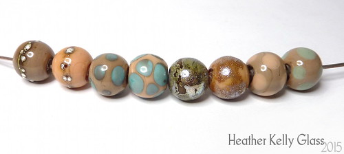
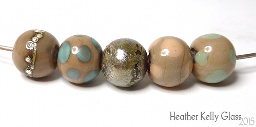
CiM colour testing: Moccasin, Autumn, Eucalyptus
New colours to test! These are the three that I picked out first, pretty autumnal opaques.
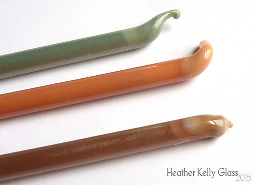
Moccasin is the milky mocha brown, Autumn is the peach, and Eucalyptus is the muted green.
They don’t strike differently when making multiple spacers – all very uniform colours.
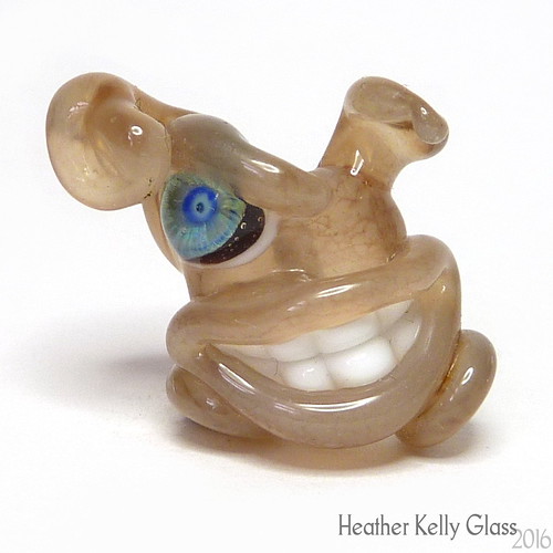
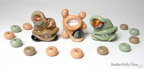
This Moccasin gremlin has a little bit of Autumn on the shoulder – I wanted to see how much they stood out against each other. Moccasin was nice and smooth to work with.
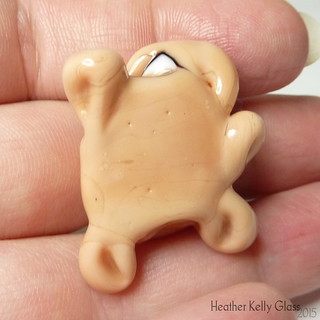
Autumn is a really lovely colour (there are not many opaque peaches!). It does have tiny micro-bubbles that come to the surface, pop, and leave little marks. These did not show up in the spacers, but do in the gremlin, particularly on the back. (There are a few on the front too but they are less obvious). The rod was also fairly shocky for me – it shot off a number of hollow cone shapes when returning the rod to the flame (rather than solid chunks, which is more usual).
Back showing pits from micro-bubbles.
Eucalyptus is a faded blue-tinged green. As a sculpture there’s a tiny bit of streaking in the colour on the flatter expanses, but not much at all.
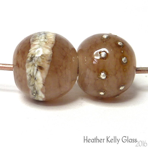
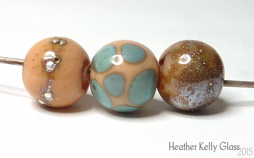
I then made some rounds to test reactions. These are all over cores of Effetre 006 clear to make them go further. This pic has them in pairs, moccasin and autumn bases with the same treatment (apart from the rightmost two, which are moccasin bases with dots of autumn or eucalyptus).
Here are all the moccasin bases together.
1) Two wraps of fine silver wire. It has darkened where the wire has actually melted in, but not fumed the rest of the bead.
2) Copper green dots. They have a crisp line round the edges and the copper green itself has greyed up a little (haven’t soaked these in anything to remove it) but there’s not much else going on.
3) Covered in fine silver leaf! This has a greenish sheen.
4) Autumn dots. This has made some streaks in the moccasin underneath, otherwise clean dots.
5) Eucalyptus dots. Very smooth join between the colours – nothing has spread or shrunk.
The autumn bases:
1) Two wraps of silver wire. Again very little fuming.
2) Copper green dots. Same effect as moccasin.
3) Fine silver leaf – colour is brownish as expected.
So, moccasin and autumn are two fairly unreactive colours that keep their original look and smoothness most of the time. Should test for silver glass bases.
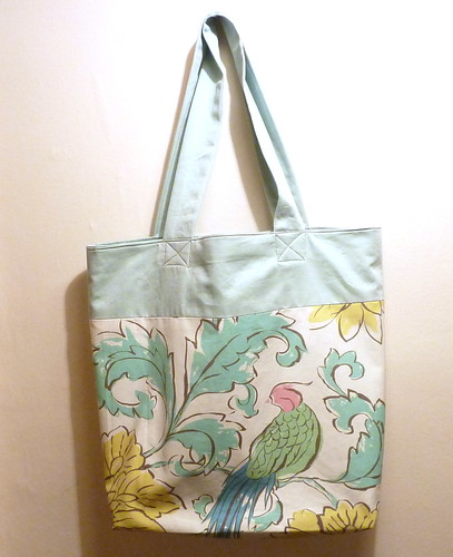
Bird of paradise tote bag
I finished this tote bag at the end of last week so I could present it to my mum. (It has been sitting around cut out for a while).
I used the Two Tone Fabric Totes tutorial, but there are hundreds of tote bag tutorials available. I picked this one as it was lined and turned inside-out for no interior seams.
Both fabrics here are from the Scrapstore – a pretty birds of paradise upholstery print and a plain aqua which is also the lining. Probably both cotton, of reasonable weight. I didn’t add any other embellishment where the fabrics join because I didn’t think it needed it – the print is big enough on its own.
Bit tricky to take good photos as it’s rather larger than the drawstring bags! So I hung it on the wall.
Front:
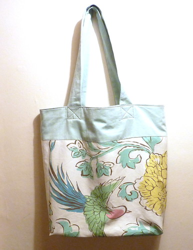
Back:
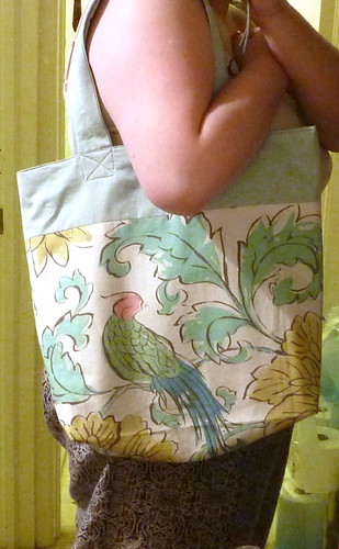
To show scale:
And finally:
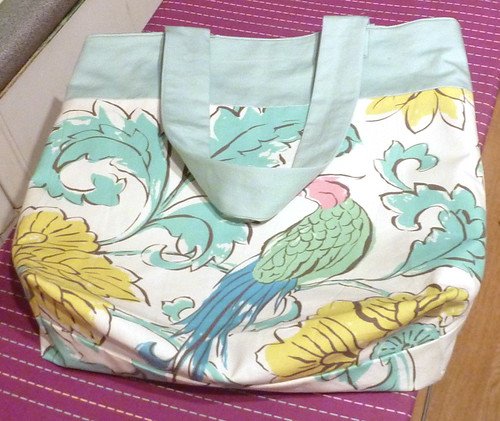
Those box-and-crosses to reinforce where the handles are attached took a fair bit of oomph from my machine to sew. There’s 6 layers of fabric there once you count the seams inside the handles.
Anyway, I think it turned out very nicely! Will have to make one for me from something. (I don’t have enough of the same print to make another).
Buy Beads
I am HeatherKellyGlass on Etsy

Flickr Photos

